Templates
The templates are standard Office files in which tags will be replaced by structured data from the JSON file. These tags are quite standardized for either .docx, .pptx or .xlsx, however there are some subtle differences. They are all able to handle JavaScript angular expressions, on which some of the basics will follow.
Tag Overview
In the table below is an overview of the available tags and their support in Word, Excel, PowerPoint, HTML, Markdown, txt and CSV respectively. For more information on each tag, see the sections that follow.
| Tag | Word | Excel | PowerPoint | HTML | Markdown | txt | CSV |
|---|---|---|---|---|---|---|---|
| {data_string} | Yes | Yes | Yes | Yes | Yes | Yes | Yes |
| {data_string_with_cell_markup$} | Yes | Yes | Yes | No | No | N/A | N/A |
| {-labels} | Yes | N/A | N/A | N/A | N/A | N/A | N/A |
| {_htmlcontent} | Yes | Yes | No | Yes (by default) | Yes (by default) | N/A | N/A |
| {!slide_loop} | N/A | N/A | Yes | N/A | N/A | N/A | N/A |
| {!excelsheet_loop} | N/A | Yes | N/A | N/A | N/A | N/A | N/A |
| {#data_loop} … {/data_loop} | Yes | Yes | Yes | Yes | Yes | Yes | Yes |
| {:inline_data_loop} … {/inline_data_loop} | No | No | No | No | No | No | Yes |
| {:data_loop_horizontal} … {/data_loop_horizontal} | Yes | Yes | No | No | No | No | No |
| {=table_row_loop} … {/table_row_loop} | N/A | N/A | Yes | N/A | N/A | N/A | N/A |
| {%imageKey} | Yes | Yes | Yes | Yes | Yes | N/A | N/A |
| {|barcode} | Yes | Yes | Yes | Yes | Yes | N/A | N/A |
| {|qrcode} | Yes | Yes | Yes | Yes | Yes | N/A | N/A |
| {$chart} | Yes | Yes | Yes | No | No | N/A | N/A |
| {<rightToLeft} | Yes | Not Necessary | Not Necessary | Not Necessary | Not Necessary | N/A | N/A |
| {+footnote} | Yes | Yes (acts as link) | No | No | No | N/A | N/A |
| {*hyperlink} | Yes | Yes | Yes | Not Necessary | Not Necessary | N/A | N/A |
| {~} | Yes | N/A | N/A | N/A | N/A | N/A | N/A |
| {@raw} | N/A | N/A | N/A | Yes | Yes | N/A | N/A |
| {span#} | N/A | Yes | N/A | Yes | N/A | N/A | N/A |
| {##static_condition} | N/A | Yes | N/A | Yes | N/A | N/A | N/A |
| {>formula} | N/A | Yes | N/A | N/A | N/A | N/A | N/A |
| {style } | Yes | N/A | Yes | N/A | N/A | N/A | N/A |
| {watermark watermark_string} | Yes | N/A | N/A | N/A | N/A | N/A | N/A |
| {?pageBreak} | Yes | Yes | No | N/A | N/A | N/A | N/A |
| {_markdownContent_} | Yes | N/A | N/A | N/A | N/A | N/A | N/A |
| {tbox text} | No | Yes | N/A | N/A | N/A | N/A | N/A |
| {?form name} | Yes | N/A | N/A | N/A | N/A | N/A | N/A |
| {*link /*target} | Yes | No | No | No | No | No | No |
| {freeze freezeLocation} | N/A | Yes | N/A | N/A | N/A | N/A | N/A |
Note: tags can't start with a number and should start with an alphabetical character (a-z,A-Z)
Special Tags:
-
{current_child_index}: Will resolve to current index of the record array, starting from 0. -
{#object|keys}{.}{/object|keys}: Will iterate over the names of the keys from the given object. If it's array then we look into the unique keys of the first 5 element.{.}will be replaced by the name of the key. Can be used for horizontal looping with unknown number of columns and columns name. -
{#object|values}{.}{/object|values}: Will iterate over the values of the given object.
The above tag {current_child_index} is useful if users wants to give an index where it's not necessary to keep track of indices. If users want to keep track of previous indexes as well, for example if users have different categories and its sub-categories like in a nested loop condition, then Cloud Office Print provides the following tags for better indexing/numbering:
-
tagName_index
For any loop tag, users can just add the suffix _index at the end of the required tag name in the template file and get the proper index.
For example:
{#orders}
{#products}

{orders_index} => This will resolve to index of the current order.

{products_index} => This will resolve to the index of the current product.

{current_child_index} => This will resolve to the index of the most inner loop in this case to that of products.

{/products}
{/orders}
-
loop_indices[number]
Similar to above tag, it also provides the index. If you have a category and its subcategory then you can use loop_indices[0] to get index of category and loop_indices[1] to get index of subcategory. Depending on the depth of items users can increase the number. This index starts from 0.
For example:
{#orders}
{#products}

{loop_indices[0]} => This will resolve to index of the current order as this is the first loop.

{loop_indices[1]} => This will resolve to the index of the current product.

{loop_indices[loop_indices.length-1]} => This will resolve to the index of the most inner loop in this case to that of products.

{/products}
{/orders}
Tag Delimiters
Cloud Office Print allows you to use a different set of delimiters. By default the delimiter used is { }. Delimiters can be explicitly specified as start_delimiter and end_delimiter inside of template as shown in the example:
"template": {
    "filename": "template.docx",
    "template_type": "docx",
    "start_delimiter": "{{",
    "end_delimiter": "}}"
}
Available sets of delimiters at the moment are: { }, {{ }}, << >>, < >.
Delimiters specified in the JSON must be used in template too. If you specify the delimiters as mentioned above, your template should contain tags wrapped in {{ }}, for example {{#orders}} ... {{/orders}}.
Word (docx) Template
These templates can contain the following tags:
{data_string} Tags
This tag, {data_string}, will be replaced by the value of the key "data_string" in the JSON file.
Data String Example
Given the JSON file with following content:
"data": [
    {
        "first_name": "DemoName",
        "last_name": "DemoLastName",
        "city": "DemoCity"
    }
]
and template.docx with following content:
{last_name} {first_name}
{city}
will result in:
DemoLastName DemoName
DemoCity
Since the template and the output objects from the json will not change, these will be omitted from the examples given below.
{#data_loop} ... {/data_loop} Tags
Using the opening tag {#data_loop} and closing tag {/data_loop}, we can loop inside the JSON array named "data_loop", meaning the items that are inside the tags will be repeated for each array element. "data_loop" is a variable. A loop tag is represented by "#" after the curly bracket.
General Data Loop Example
Given the JSON file with following content:
"data": [
    {
        "people": [
            {
                "first_name": "DemoName1",
                "last_name": "DemoLastName1",
                "city": "DemoCity1"
            },
            {
                "first_name": "DemoName2",
                "last_name": "DemoLastName2",
                "city": "DemoCity2"
            },
            {
                "first_name": "DemoName3",
                "last_name": "DemoLastName3",
                "city": "DemoCity3"
            }
        ]
    }
]
and template.docx with following content:
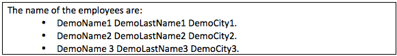
The name of the employees are:
{#people}{first_name} {last_name} from city {city}.
{/people}
will result in:
The name of the employees are:
DemoName1 DemoLastName1 from city DemoCity1.
DemoName2 DemoLastName2 from city DemoCity2.
DemoName3 DemoLastName3 from city DemoCity3.
Loops in Table Example
Using the previous data, if the template is changed to:
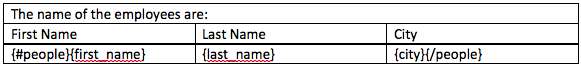
The result will then be:
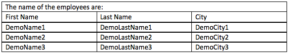
Loops with Numbering Example
Using the previous data, if the template is changed to:

The result will be:
Loops in Bullets
The same can be done with bullets:

This will result in:
Math Operations during a Loop
Numeric operations inside a loop are supported by using the | operator. The following operations are supported:
|sum, calculates the total sum of a numeric property during a loop.|avg, calculates the total average of a numeric property during a loop.|min, returns the minimum numeric value of a property during a loop.|max, returns the maximum numeric value of a property during a loop.
The syntax is the following:
{array|(min|max|sum|avg):"attributeToApplyTo":takeNullValueIntoAccount:valueForNull}
concretely:
{product |sum:"quantity":true:0}
{product |max:"quantity":false}
{product |avg:"quantity":false}
{product |min:"quantity":false}
The operation can also be used across multiple hierarchy. The syntax for it would be depth1:depth2:depth3:property_to_operate_on.
Lets take an example for calculating the sum of the quantities of the products across the array of orders, we can chain the attribute as product:quantity.
Note: Please avoid number with precision > 15 digits.
{orders|sum:"product:quantity":true:0} => for each element of orders, take the sum of the quantity of the products of this order.
{orders|max:"product:quantity":false}
{orders|avg:"product:quantity":false}
{orders|min:"product:quantity":false}
Mathematical operations can be performed inside these operations. Lets take an example for calculating the sum of the products of quantities of the products and unit_price, we can chain the attribute as {product | sum:"quantity*unit_price":true:0}.
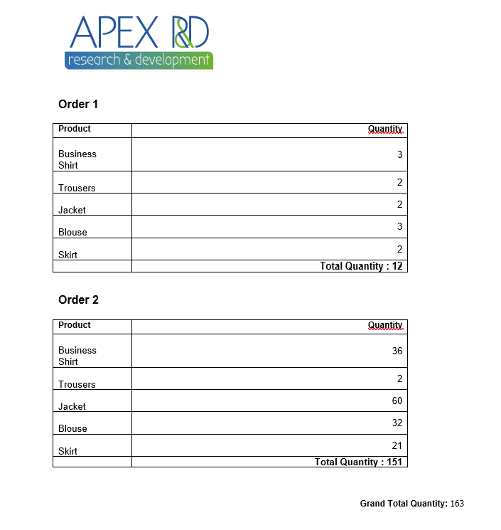
The following template is given:
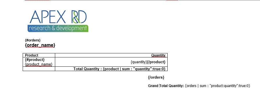
Results in:
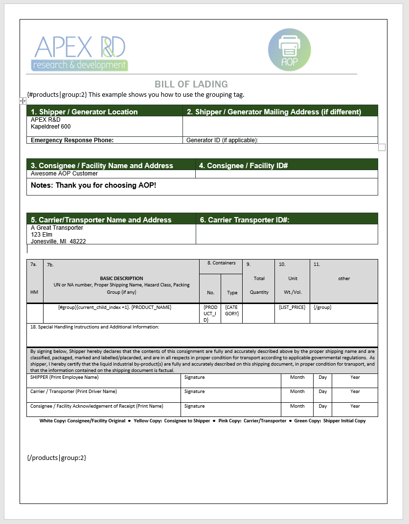
Grouping Elements of Arrays
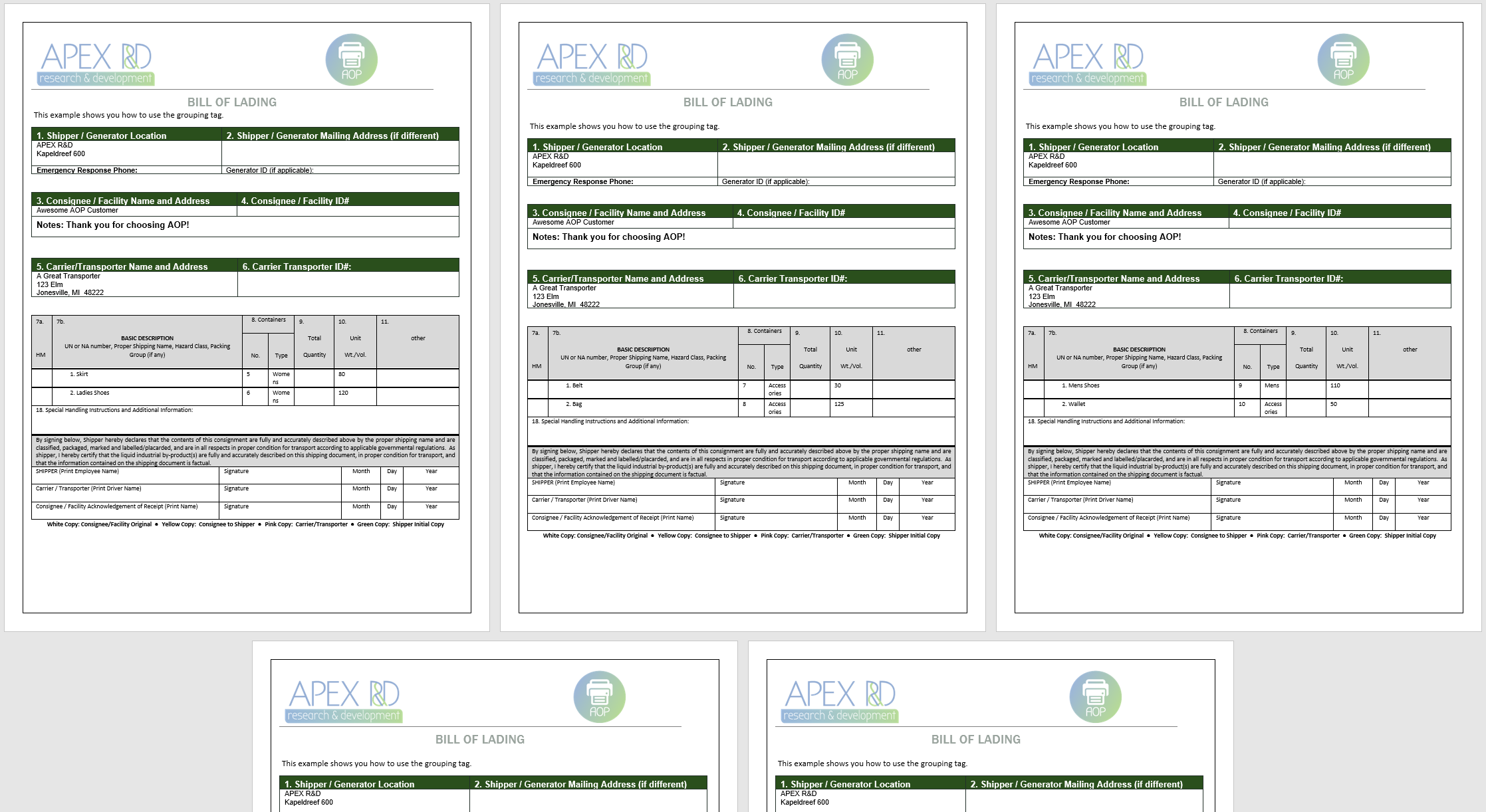
It is possible to group arrays into n number of elements by appending |group:n at the start and end labels of the loop. This will for example allow you to print a slide or a page per x products. The current group can be looped over by {#group} {/group} looping tags.
For example:
Given the data
"products": [
    {
        "PRODUCT_ID": 5,
        "PRODUCT_NAME": "Skirt",
        "PRODUCT_DESCRIPTION": "Wrinkle free skirt",
        "CATEGORY": "Womens",
        "PRODUCT_AVAIL": "Y",
        "LIST_PRICE": 80
    },
    {
        "PRODUCT_ID": 6,
        "PRODUCT_NAME": "Ladies Shoes",
        "PRODUCT_DESCRIPTION": "Low heel and cushioned interior for comfort and style in simple yet elegant shoes",
        "CATEGORY": "Womens",
        "PRODUCT_AVAIL": "Y",
        "LIST_PRICE": 120
    },
    {
        "PRODUCT_ID": 7,
        "PRODUCT_NAME": "Belt",
        "PRODUCT_DESCRIPTION": "Leather belt",
        "CATEGORY": "Accessories",
        "PRODUCT_AVAIL": "Y",
        "LIST_PRICE": 30
    },
    {
        "PRODUCT_ID": 8,
        "PRODUCT_NAME": "Bag",
        "PRODUCT_DESCRIPTION": "Unisex bag suitable for carrying laptops with room for many additional items",
        "CATEGORY": "Accessories",
        "PRODUCT_AVAIL": "Y",
        "LIST_PRICE": 125
    },
    {
        "PRODUCT_ID": 9,
        "PRODUCT_NAME": "Mens Shoes",
        "PRODUCT_DESCRIPTION": "Leather upper and lower lace up shoes",
        "CATEGORY": "Mens",
        "PRODUCT_AVAIL": "Y",
        "LIST_PRICE": 110
    },
    {
        "PRODUCT_ID": 10,
        "PRODUCT_NAME": "Wallet",
        "PRODUCT_DESCRIPTION": "Travel wallet suitable for men and women. Several compartments for credit cards, passports and cash",
        "CATEGORY": "Accessories",
        "PRODUCT_AVAIL": "Y",
        "LIST_PRICE": 50
    },
    {
        "PRODUCT_ID": 1,
        "PRODUCT_NAME": "Business Shirt",
        "PRODUCT_DESCRIPTION": "Wrinkle-free cotton business shirt",
        "CATEGORY": "Mens",
        "PRODUCT_AVAIL": "Y",
        "LIST_PRICE": 50
    },
    {
        "PRODUCT_ID": 2,
        "PRODUCT_NAME": "Trousers",
        "PRODUCT_DESCRIPTION": "Black trousers suitable for every business man",
        "CATEGORY": "Mens",
        "PRODUCT_AVAIL": "Y",
        "LIST_PRICE": 80
    },
    {
        "PRODUCT_ID": 3,
        "PRODUCT_NAME": "Jacket",
        "PRODUCT_DESCRIPTION": "Fully lined jacket which is both professional and extremely comfortable to wear",
        "CATEGORY": "Mens",
        "PRODUCT_AVAIL": "Y",
        "LIST_PRICE": 150
    },
    {
        "PRODUCT_ID": 4,
        "PRODUCT_NAME": "Blouse",
        "PRODUCT_DESCRIPTION": "Silk blouse ideal for all business women",
        "CATEGORY": "Womens",
        "PRODUCT_AVAIL": "Y",
        "LIST_PRICE": 60
    }
]
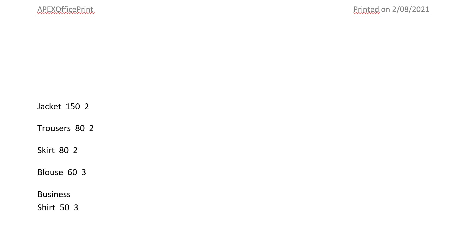
You can use the following tags
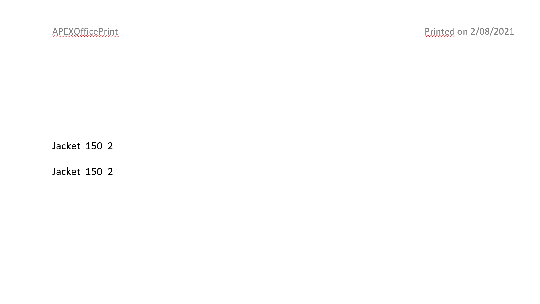
{#products|group:2}
{#group}{current_child_index +1}. {PRODUCT_NAME} {PRODUCT_ID} {CATEGORY} {LIST_PRICE}{/group}
{/products|group:2}
Here is an example of a template:
This would result in:
In this example the products are grouped per 2 products. However if you want the number to be dynamic depending on the description, you can use the smart grouping filter.
{#(products|smartgroup:"PRODUCT_DESCRIPTION":20:30)}
Here we are looking at the product description attribute of products and then grouping them with max of 20 lines given each line should contain 30 characters.
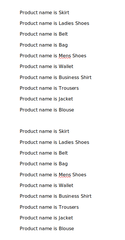
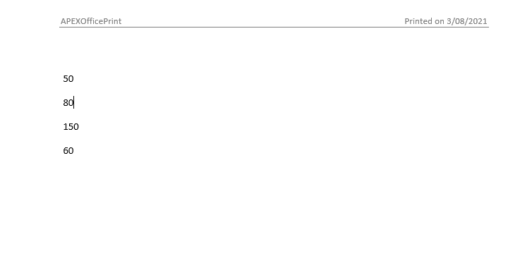
Looping n Times
With this filter one can loop n times for arrays or single attributes. Our data is the same as above. The syntax for this filter is as follows:
{#3|loop}
    {#products}
        Product name is {PRODUCT_NAME}
    {/products}
{/3|loop}
The result of this loop is as follows:
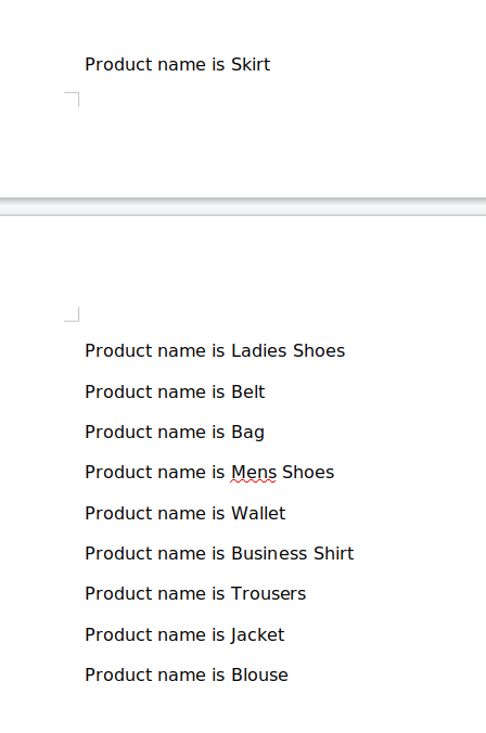
Instead of using the hardcoded value 3 there, one can also put that value inside the json data provided. If this is the json data provided:
{
    "loopLength": 3
}
This "loopLength" value can be either integer 3 or string "3". Using the syntax below one would get the same result.
{#loopLength|loop}
    {#products}
        Product name is {PRODUCT_NAME}
    {/products}
{/loopLength|loop}
Note that this n time looping supports up to 5000 loops.
Filtering
With this filter we can filter a data in an array, the operations allowed on filter are '<', '>', '<=', '>=', '==', '===', '!=', '!==', for the data same as above, the use of filter is as follows:
{#products|filter:"unit_price":">":"100"} {#filtered} {product_name} {quantity}
{unit_price} {/filtered} {/products|filter:"unit_price":">":"100"}
The result of this break implementation is as follows:
Sorting
With this filter we can sort the items in an array, by its value or property. Along with the property, type of sorting should also be defined as "asc" for ascending and "desc" for descending.
{#products|sort:"unit_price":"asc"} {#sorted} {product_name} {quantity}
{unit_price} {/sorted} {/products|sort:"unit_price":"asc"}
The result of this break implementation is as follows:
If we want to sort according to multiple values, for example "unit_price" as ascending and sort by "quantity" for those "unit_price" that are equal in descending order, we can specify :
{#products|sort:"unit_price:quantity":"asc:desc"} {#sort} {product_name}
{quantity} {unit_price} {/sort}
{/products|sort:"unit_price:quantity":"asc:desc"}
This would sort by unit_price at first and if two values of unit_price are equal, it would sort by quantity.
Distinct
With this filter we can get distinct items in an array. For example:
{#products|distinct:"unit_price":"asc"} {unit_price}
{/products|distinct:"unit_price":"asc"}
The result of this break implementation is as follows:
Breaking into Groups
With this filter one can break data array into groups based on the group parameter given. Our data is the same as above. The syntax for this filter is as follows:
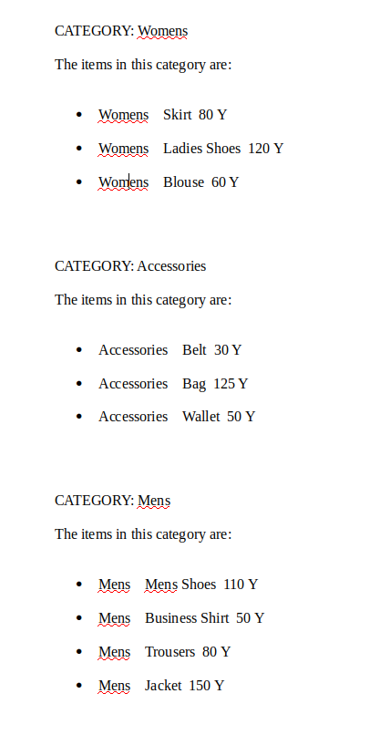
{#products|break:"CATEGORY"}
CATEGORY: {break[0].CATEGORY}
The items in this category are:
{#break}
 • {CATEGORY} {PRODUCT_NAME} {LIST_PRICE} {PRODUCT_AVAIL}
{/break}
{/products|break:"CATEGORY"}
The result of this break implementation is as follows:
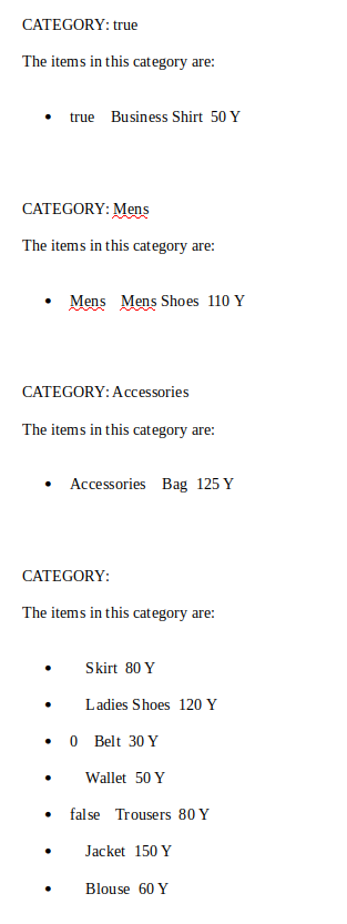
One can pass two additional parameter. First one is for sorting. It has two options asc for ascending order and desc for descending order. Second parameter is positioning the null value group. It has two options first and last. They are positioned as the naming suggests in the beginning or at the end of the document respectively. Using the syntax below,
{#products|break:"CATEGORY":"desc":"last"}
CATEGORY: {break[0].CATEGORY}
The items in this category are:
{#break}
 • {CATEGORY} {PRODUCT_NAME} {LIST_PRICE} {PRODUCT_AVAIL}
{/break}
{/products|break:"CATEGORY":"desc":"last"}
one would get the following result:
This tag supports multiple breaking parameters. By using the following syntax you can filter your data with multiple parameters:
{#products|break:"CATEGORY:PRODUCT_AVAIL":"desc":"last"}
CATEGORY: {break[current_child_index].CATEGORY}
The items in this category are:
{#break}
 • {CATEGORY} {PRODUCT_NAME} {LIST_PRICE} {PRODUCT_AVAIL}
{/break}
{/products|break:"CATEGORY:PRODUCT_AVAIL":"desc":"last"}
Horizontal Tabular Looping
Cloud Office Print also supports horizontal tabular looping using the {:horizontal_loop} ... {/horizontal_loop} tags. However, this tag can be used to repeat only one row (in Word, in Excel this works like normal loop tag and repeats the cells defined by the rectangular boundary of starting and closing tag). Following is an example on how this could be used:
{%imagekey} Tags
This tag is the same as {data_string} but instead of getting replaced by a string this tag is replaced by an image that is placed in the value of key "imagekey" after base64 encoding. Note that imagekey is just a variable. An image tag is represented by "%" after curly bracket. You can also specify a fixed width, height or alternative text(alt text) by adding following values "imagekey_width", "imagekey_height" or "imagekey_alt_text". If you want to scale your image proportionally you can use the "imagekey_max_width" and "imagekey_max_height" tags. The imagekey is pic, so we can use pic_max_width for example.
- "imagekey_width" : "80px" (For specifying fixed width of image)
- "imagekey_height" : "80px" (For specifying fixed height of image)
- "imagekey_alt_text" : "Alternative image text" (For specifying alternative image)
- "imagekey_max_height" : "80px" (Maximum height for scaling image proportionally)
- "imagekey_max_width" : "80px" (Maximum width for scaling image proportionally)
- "imagekey_transparency" : "80%" (For specifying transparency of image)
- "imagekey_rotation" : "90" (For specifying rotation to image)
- "imagekey_url" : "http://www.dummyimage.com/sampleimage" (For specifying url of image)
Exif information is taken into account if it exists in image.
We have included support for other units other than px (default), in, cm, pt, and em.
The given data can be a base64 encoded image or a URL pointing to an image (the URL must have image extension) or a FTP server image.
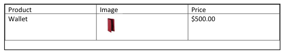
Image Tag Example
Replace /...code..../ by the base64 encoded string of the image
"data": [
    {
        "product_name": "Wallet",
        "price": "$500.00",
        "pic": "/...code..../",
        "pic_max_width": 100,
        "pic_max_height": 100,
        "pic_alt_text": "alternative text"
    }
]
with template:
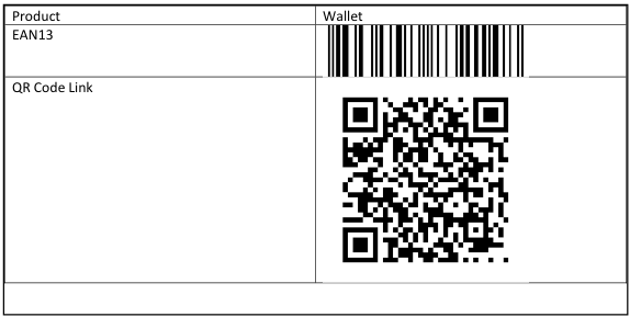
| Product | Image | Price |
|---|---|---|
| {product_name} | {%pic} | {price} |
will result in:
Text Wrapping Around Image
This is an extension for image tag. Syntax for this tag is similar with width and height tag. This can be used by adding "_wrap_text" after the image tag inside the JSON file
"data": [
    {
        "pic": "/...code.../",
        "pic_max_width": 100,
        "pic_max_height": 100,
        "pic_alt_text": "alternative text",
        "pic_wrap_text": "square" // wrap option
    }
]
This tag only supports 5 of the Microsoft Word Text Wrapping options. These options are:
- In line with text : This option is default. If no wrap option is specified images will be wrapped in line with text.
- Square : In order to use this property, wrap option should be "square".
- Top and Bottom : In order to use this property, wrap option should be "top-bottom".
- Behind Text : In order to use this property, wrap option should be "behind".
- In Front of Text : In order to use this property, wrap option should be "front".
Wrapping text around images is not possible on PowerPoint or Excel files. But PowerPoint provides a formatting tool which decides in which layer an image can be shown. Cloud Office Print supports this property. While creating the template use "bring forward" or "send backward" on the desired image tag to decide in which layer that image will be shown.
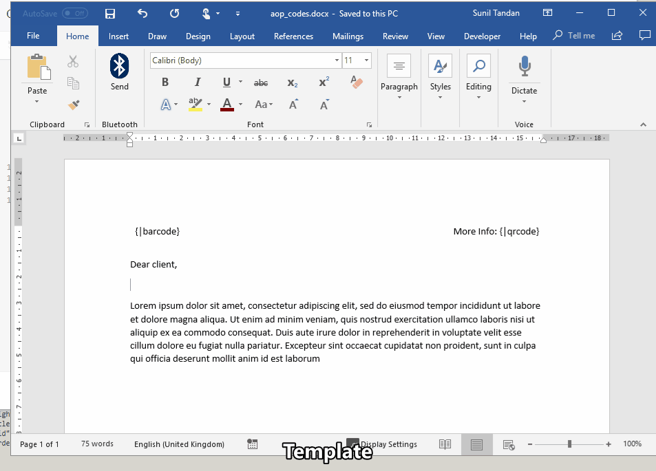
{|barcode} / {|qrcode} Tags
This tag will be replaced by the barcode or QR code created using the data of the key named "barcode" or "qrcode". Notice that these are also variable. Barcode or qrcode tags are represented by | after the curly bracket. If this tag is found in the document there must be additional supporting keys containing the options for these tags. These options are:
-
key_type, e.g. "barcode_type" if the key used is "barcode".
This field contains the type of the required barcode. The options are:Barcode type Description auspost AusPost 4 State Customer Code azteccode Aztec Code azteccodecompact Compact Aztec Code aztecrune Aztec Runes bc412 BC412 channelcode Channel Code codablockf Codablock F code11 Code 11 code128 Code 128 code16k Code 16K code2of5 Code 25 code32 Italian Pharmacode code39 Code 39 code39ext Code 39 Extended code49 Code 49 code93 Code 93 code93ext Code 93 Extended codeone Code One coop2of5 COOP 2 of 5 daft Custom 4 state symbology databarexpanded GS1 DataBar Expanded databarexpandedcomposite GS1 DataBar Expanded Composite databarexpandedstacked GS1 DataBar Expanded Stacked databarexpandedstackedcomposite GS1 DataBar Expanded Stacked Composite databarlimited GS1 DataBar Limited databarlimitedcomposite GS1 DataBar Limited Composite databaromni GS1 DataBar Omnidirectional databaromnicomposite GS1 DataBar Omnidirectional Composite databarstacked GS1 DataBar Stacked databarstackedcomposite GS1 DataBar Stacked Composite databarstackedomni GS1 DataBar Stacked Omnidirectional databarstackedomnicomposite GS1 DataBar Stacked Omnidirectional Composite databartruncated GS1 DataBar Truncated databartruncatedcomposite GS1 DataBar Truncated Composite datalogic2of5 Datalogic 2 of 5 datamatrix Data Matrix datamatrixrectangular Data Matrix Rectangular dotcode DotCode ean13 EAN-13 ean13composite EAN-13 Composite ean14 GS1-14 ean2 EAN-2 (2 digit addon) ean5 EAN-5 (5 digit addon) ean8 EAN-8 ean8composite EAN-8 Composite flattermarken Flattermarken gs1-128 GS1-128 gs1-128composite GS1-128 Composite gs1-cc GS1 Composite 2D Component gs1datamatrix GS1 Data Matrix gs1datamatrixrectangular GS1 Data Matrix Rectangular gs1northamericancoupon GS1 North American Coupon gs1qrcode GS1 QR Code hanxin Han Xin Code hibcazteccode HIBC Aztec Code hibccodablockf HIBC Codablock F hibccode128 HIBC Code 128 hibccode39 HIBC Code 39 hibcdatamatrix HIBC Data Matrix hibcdatamatrixrectangular HIBC Data Matrix Rectangular hibcmicropdf417 HIBC MicroPDF417 hibcpdf417 HIBC PDF417 hibcqrcode HIBC QR Code iata2of5 IATA 2 of 5 identcode Deutsche Post Identcode industrial2of5 Industrial 2 of 5 interleaved2of5 Interleaved 2 of 5 (ITF) isbn ISBN ismn ISMN issn ISSN itf14 ITF-14 japanpost Japan Post 4 State Customer Code kix Royal Dutch TPG Post KIX leitcode Deutsche Post Leitcode matrix2of5 Matrix 2 of 5 maxicode MaxiCode micropdf417 MicroPDF417 microqrcode Micro QR Code msi MSI Modified Plessey onecode USPS Intelligent Mail pdf417 PDF417 pdf417compact Compact PDF417 pharmacode Pharmaceutical Binary Code pharmacode2 Two-track Pharmacode planet USPS PLANET plessey Plessey UK posicode PosiCode postnet USPS POSTNET pzn Pharmazentralnummer (PZN) qrcode QR Code rationalizedCodabar Codabar raw Custom 1D symbology royalmail Royal Mail 4 State Customer Code sscc18 SSCC-18 symbol Miscellaneous symbols telepen Telepen telepennumeric Telepen Numeric ultracode Ultracode upca UPC-A upcacomposite UPC-A Composite upce UPC-E upcecomposite UPC-E Composite -
key_height, e.g. "barcode_height" if the key used is "barcode".
This field contains the height for the generated image. Default is 200 for QR, 50 for the rest. -
key_width, e.g. "barcode_width" if they key used is "barcode".
This field contains the width for the generated image. Default is 200. -
key_errorcorrectlevel (only for QR code), e.g. "qrcode_errorcorrectlevel" if {|qrcode} is used as tag..
This field contains the level of which the QR code should be recoverable. The options are:- "L" (up to 7% damage)
- "M" (up to 15% damage)
- "Q" (up to 25% damage)
- "H" (up to 30% damage)
Extra info: http://www.qrcode.com/en/about/error_correction.html
-
(Not in use since 19.3) key_cellsize (only for QR code), e.g. "qrcode_cellsize". This field contains the dot size of a module. Default is 4.
Extra info: http://www.qrcode.com/en/howto/cell.html -
key_url, the URL to hyperlink to when the barcode/qrcode is clicked
-
key_rotation, the rotation angle of the barcode/qrcode (in degrees, counterclockwise)
-
key_background_color, the background color for the barcode/qrcode. default: white/ffffff. You can provide hex value; html named colors like red, white, purple; rgb(255, 0, 0) ; or any other css supported format.
-
key_padding_width, the padding of the inserted qrcode/barcode. default 10. In pixels
-
key_padding_height, the padding of the inserted qrcode/barcode. default 10. In pixels
-
key_extra_options, if you want to include extra options like including barcode text on the bottom, please use this option. The options should be space separated and should be followed by a "=" and their value. E.g.: "includetext guardwhitespace" or "eclevel=L". Please visit: github.com/bwipp/postscriptbarcode/wiki/Symbologies-Reference for all option availability.
You might sometimes get the following error (might occur when the tag is inside loop):
The tag "qrcode" is not inside a paragraph
In this case, just change the style of the tag (the whole {|qrcode}), for example change the text color to red, and the error should be resolved.
Barcode Tag Example
Given the JSON file:
"data": [
    {
        "product_name": "Wallet",
        "product_code": "1896547832148",
        "product_code_type": "ean13",
        "product_link": "https://www.google.be/search?q=wallet",
        "product_link_type": "qrcode"
    }
]
and template as:
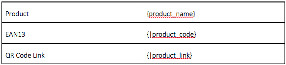
will result in:
For QR codes, we can specify the following options.
{
    "products": [
        {
            "product_name": "Chocolates",
            "product_name_type": "qrcode",
            "product_name_qr_dotscale": 1, // For body block, must be greater than 0, less than or equal to 1. default is 1
            "product_name_qr_logo": "Image(URL/Base64)", // Logo Image (At center of QR)
            "product_name_qr_background_image": "Image(URL/Base64)", // Background Image
            "product_name_qr_color_dark": "#111111",
            "product_name_qr_color_light": "#dddddd",
            "product_name_qr_logo_width": 80, // Width of logo
            "product_name_qr_logo_height": 80, // Height of logo
            "product_name_qr_logo_background_color": "#dddddd",
            "product_name_qr_quiet_zone": 2, // For padding around qr code
            "product_name_qr_quiet_zone_color": "#000000", // Color of padding area
            "product_name_qr_background_image_alpha": 0.3, // Background image transparency, value between 0 and 1. default is 1
            "product_name_qr_po_color": "#e1622f", // Global Position Outer color. if not set, the defaut is `colorDark`
            "product_name_qr_pi_color": "#aa5b71", // Global Pisotion Inner color. if not set, the defaut is `colorDark`
            "product_name_qr_po_tl_color": "#aabbcc", // Position Outer color - Top Left
            "product_name_qr_pi_tl_color": "#231333", // Position Inner color - Top Left
            "product_name_qr_po_tr_color": "#342442", // Position Outer color - Top Right
            "product_name_qr_pi_tr_color": "#ab2134", // Position Inner color - Top Right
            "product_name_qr_po_bl_color": "#4380ba", // Position Outer color - Bottom Left
            "product_name_qr_pi_bl_color": "#e2b454", // Position Inner color - Bottom Left
            "product_name_qr_timing_v_color": "#ac2059", // Vertical timing color
            "product_name_qr_timing_h_color": "#376d71", // Horizontal timing color
            "product_name_qr_timing_color": "#376d71", // Global Timing color. if not set
            "product_name_qr_auto_color": true, // Automatic color adjustment(for data block) (default is false) (set to false if using background images)
            "product_name_qr_auto_color_dark": "#000000", // Automatic color: dark CSS color (only required when qr_auto_color is set true) (dark color prefered, otherwise may lead to undetectable QR)
            "product_name_qr_auto_color_light": "#ffffff" // Automatic color: light CSS color (only required when qr_auto_color is set true)
        }
    ]
}
These options will result in the following QR code.

The structure of a QR code can be represented as:

QR Codes can be generated for specific tasks like connecting to the WiFi, sending mails, contact details etc. , the JSON structure for these tasks is as follows.
WiFi
For connecting to a wireless network, wifi ssid, wifi password and encryption type can be specified, where encryption types can be WPA, WEP, WEP2 etc.
{
    "data_key": "SSID of wireless",
    "data_key_type": "qr_wifi",
    "data_key_wifi_password": "pass123",
    "data_key_wifi_encryption": "WPA",
    "data_key_wifi_hidden": true // should be boolean (true if hidden and false if not)
}
Telephone Number
For creating a dialing action, the telephone number should be specified as follows.
{
    "data_key": "+3216298447", // Then use {|company_phone} tag.
    "data_key_type": "qr_telephone"
}
For sending email, email address, cc, bcc, subject and body can be specified
{
    "data_key": "support@cloudofficeprint.com",
    "data_key_type": "qr_email",
    "data_key_email_cc": "dgielis@cloudrnd.be",
    "data_key_email_bcc": "standan@cloudrnd.be",
    "data_key_email_subject": "Regarding Cloud Office Print Subscription",
    "data_key_email_body": "Hello, I'd like to know about pricing of Cloud Office Print on premise version."
}
SMS
SMS messages can be sent using QR codes generated. For this, data should be specified in following format.
{
    "data_key": "+3216298447",
    "data_key_type": "qr_sms",
    "data_key_sms_body": "Hello, I'd like to know about pricing of Cloud Office Print on premise version."
}
URL
A QR code can be used to be redirected to a URL to any webpage (Facebook, Twitter, Linkedin, Instagram etc.). The URL should be in standard format eg. https://united-codes.com/
{
    "data_key": "https://united-codes.com/",
    "data_key_type": "qr_url"
}
vCard
A VCF or vCard can be specified on a QR code with the options shown in following JSON.
{
    "data_key": "John", // Firstname
    "data_key_type": "qr_vcard",
    "data_key_vcard_lastname": "Doe",
    "data_key_vcard_email": "support@cloudrnd.com",
    "data_key_vcard_website": "https://united-codes.com/"
}
MECard
A MECard can be specified on a QR code with the options shown in following JSON.
{
    "data_key": "John", // Firstname
    "data_key_type": "qr_me_card",
    "data_key_me_card_lastname": "Doe",
    "data_key_me_card_nickname": "johnny",
    "data_key_me_card_email": "support@cloudrnd.com",
    "data_key_me_card_contact_primary": "+3216298447",
    "data_key_me_card_contact_secondary": "+33216298447",
    "data_key_me_card_contact_tertiary": "+33216298447",
    "data_key_me_card_website": "https://united-codes.com/",
    "data_key_me_card_birthday": "1997/05/05",
    "data_key_me_card_notes": "Lodata_key"
}
GeoLocation
Location on a map can be specified using longitude latitude and altitude as follows.
{
    "data_key": "50.86217975966617", // Latitude
    "data_key_type": "qr_geolocation",
    "data_key_geolocation_longitude": "4.671840782417369",
    "data_key_geolocation_altitude": "100"
}
Events
Events on a calendar can be specified on a QR code with the options shown in following JSON. Summary, event_startdate, event_enddate and event_format are compulsary to get a valid QR code,
{
    "data_key": "Cloud Office Print Training Session", // Summary of events
    "data_key_type": "qr_event",
    "data_key_event_startdate": "2020/01/23",
    "data_key_event_enddate": "2020/01/24"
}
For barcodes, instead of doing the above, you could also choose to install a barcode font, for example Free 3of9 or dafont.com/3of9-barcode.font. Barcode fonts are more performant than images. See the other section for more information about language and font support.
{$chart} Tags
This tag will be replaced by a chart created using the data of the key named "chart". Notice that this key is a variable. Charts are represented by a "$" after the curly bracket. If this tag is found in the document the chart object in the JSON must follow a certain structure. Firstly, an optional object with key "options" can be specified to determine the options for the chart. All color options are in CSS color format, e.g. 'DeepSkyBlue', '#00bfff', 'rgb(0,191,255)' ...
All style options are objects:
"defaultStyle": {
    "italic": false, // if the text should be in italics
    "bold": false, // if the text should be bold
    "color": "undefined", // the text color, CSS format
    "font": "undefined" // the text font name, e.g. "calibri"
}
The default options are:
"defaultOptions" = {
    "width": 576, // width of the chart
    "height": 336, // height of the chart
    "grid": "undefined", // deprecated (use majorGridlines and minorGridlines options per axis instead), if a grid should be shown
    "border": true, // if a border should be shown
    "roundedCorners": false, // if chart object should have rounded corners
    // note: displaying rounded corners is not supported by LibreOffice
    "backgroundColor": "undefined", // background color for the entire chart
    "backgroundOpacity": "undefined", // opacity for the entire chart (see note below)
    "title": "undefined", // the chart title
    "titleStyle": "undefined", // chart title style
    "legend": {
        "showLegend": true, // if the legend should be shown
        "position": "r", // "l" for left, "r" right, "b" bottom, "t" top
        "style": "undefined" // style for legend text
    },
    "dataLabels": {
        "showDataLabels": false, // can be true or false, default true for pie/pie3d and doughnut.
        "separator": false, // can be either false or anything else for example \n or \t or ; or (, if false)
        "showSeriesName": false, // include the series name in the data label, true or false
        "showCategoryName": false, // include the series category name in the data label, true or false
        "showLegendKey": false, // include the legend key (i.e the color of the series) in the data label, true or false
        "showValue": false, // include the actual value in the data label
        "showPercentage": false, // include the percentage, default true for pie/pie3d and doughnut
        "position": "center" // position to show the data label, can be "center", "left", "right", "above", "below", "insideBase", "bestFit", "outsideEnd", "insideEnd". note that not all options might be available for specific charts.
    },
    "axis": {
        "x": {
            "orientation": "minMax", // or "maxMin"
            "min": "undefined", // a specific number
            "max": "undefined", // a specific number
            "type": "undefined", // or "date" : for date, "number" : for numerical data in x-axis to get linear category axis
            "date": {
                // date options, only for stock charts.
                "format": "unix",
                "code": "mm/yy",
                "unit": "months",
                "step": "1"
            },
            "title": "undefined", // title for x-axis
            "showValues": true, // options to disable showing the values in axis
            "valuesStyle": "undefined", // axis values style
            "titleStyle": "undefined", // axis title style
            "titleRotation": 0, // text rotation in degrees, clockwise from horizontal axis
            "majorGridlines": false, // show major grid lines
            "majorUnit": "undefined", // automatic when undefined, spacing between major grid lines and axis values
            "minorGridlines": false, // show minor grid lines
            "minorUnit": "undefined" // automatic when undefined, spacing between minor grid lines
        },
        "y": {
            "orientation": "minMax",
            "mix": "undefined",
            "max": "undefined",
            "title": "undefined", // title for y-axis
            "showValues": true, // options to disable showing the values in axis
            "valuesStyle": "undefined", // axis values style
            "titleStyle": "undefined", // axis title style
            "titleRotation": -90, // text rotation in degrees, clockwise from horizontal axis
            "majorGridlines": true, // show major grid lines
            "majorUnit": "undefined", // automatic when undefined, spacing between major grid lines and axis values
            "minorGridlines": false, // show minor grid lines
            "minorUnit": "undefined", // automatic when undefined, spacing between minor grid lines
            "formatCode": "General" // format code for axis data, "General", "Number" ...
        },
        "y2": {
            //If using multiple charts and axis on the right side
            "orientation": "minMax",
            "mix": "undefined",
            "max": "undefined",
            "title": "undefined", // title for y2 axis
            "showValues": true, // options to disable showing the values in axis
            "valuesStyle": "undefined", // axis values style
            "titleStyle": "undefined", // axis title style
            "titleRotation": -90, // text rotation in degrees, clockwise from horizontal axis
            "majorGridlines": true, // show major grid lines
            "majorUnit": "undefined", // automatic when undefined, spacing between major grid lines and axis values
            "minorGridlines": false, // show minor grid lines
            "minorUnit": "undefined", // automatic when undefined, spacing between minor grid lines
            "formatCode": "General" // format code for axis data, "General", "Number" ...
        }
    }
}
Note: backgroundOpacity is ignored if backgroundColor is not specified or if backgroundColor is specified in a color space which includes an alpha channel (e.g. rgba(0,191,255,0.5)). In the latter case, the alpha channel in backgroundColor is used.
Secondly, the type of chart should be determined by the "type" key. Allows you to add custom colors to the series. Just provide color at the same level as you provide the name for the series. See Line example: The generation of following types of charts is supported:
line
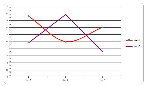
This is a normal chart where the data points are connected with lines. Multiple lines can be generated. The chart key should contain an array of line objects. Each line object should contain the data to be connected and the name of the line. E.g.:
"chart": {
    "lines": [
        {
            "data": [
                {
                    "x": "day 1",
                    "y": "4.3"
                },
                {
                    "x": "day 2",
                    "y": "2.5"
                },
                {
                    "x": "day 3",
                    "y": "3.5"
                }
            ],
            "name": "line 1",
            "smooth": true, // can be false
            "symbol": "square", // can be diamond triangle
            // "symbolSize" is supported (in em, pt, px, cm or in), by default: automatic
            "color": "red", // can be html/css colors, hex values.
            "lineWidth": "0.2cm" // value should be in em, pt, px, cm or in
        },
        {
            "data": [
                {
                    "x": "day 1",
                    "y": "2.4"
                },
                {
                    "x": "day 2",
                    "y": "4.4"
                },
                {
                    "x": "day 3",
                    "y": "1.8"
                }
            ],
            "name": "line 2",
            "color": "purple", // can be html/css colors, hex values.
            "lineStyle": "sysDashDotDot" // see below for possible values
        }
    ],
    "type": "line"
}
will result in :
The supported values for "lineStyle" are:
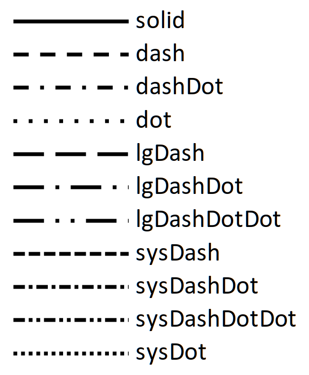
The default "lineStyle" is "solid".
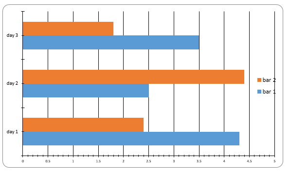
bar
In order to generate a bar chart, the chart object should contain an array named bars. This array must contain the objects with data for the bar and the name of the bar. For example, the following JSON:
"chart": {
    "bars": [
        {
            "data": [
                {
                    "x": "day 1",
                    "y": "4.3"
                },
                {
                    "x": "day 2",
                    "y": "2.5"
                },
                {
                    "x": "day 3",
                    "y": "3.5"
                }
            ],
            "name": "bar 1"
        },
        {
            "data": [
                {
                    "x": "day 1",
                    "y": "2.4"
                },
                {
                    "x": "day 2",
                    "y": "4.4"
                },
                {
                    "x": "day 3",
                    "y": "1.8"
                }
            ],
            "name": "bar 2"
        }
    ],
    "type": "bar"
}
will result in:
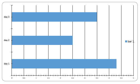
A single bar chart is generated as follows:
"chart": {
    "bars": [
        {
            "data": [
                {
                    "x": "day 1",
                    "y": "4.3"
                },
                {
                    "x": "day 2",
                    "y": "2.5"
                },
                {
                    "x": "day 3",
                    "y": "3.5"
                }
            ],
            "name": "bar 1"
        }
    ],
    "type": "bar"
}
Resulting in:
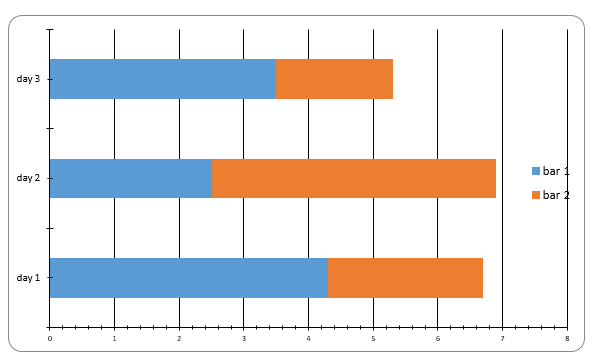
barStacked
This is similar to a bar chart but the bars from the same category will be stacked. For example, given the following:
"chart": {
    "bars": [
        {
            "data": [
                {
                    "x": "day 1",
                    "y": "4.3"
                },
                {
                    "x": "day 2",
                    "y": "2.5"
                },
                {
                    "x": "day 3",
                    "y": "3.5"
                }
            ],
            "name": "bar 1"
        },
        {
            "data": [
                {
                    "x": "day 1",
                    "y": "2.4"
                },
                {
                    "x": "day 2",
                    "y": "4.4"
                },
                {
                    "x": "day 3",
                    "y": "1.8"
                }
            ],
            "name": "bar 2"
        }
    ],
    "type": "barStacked"
}
will result in:
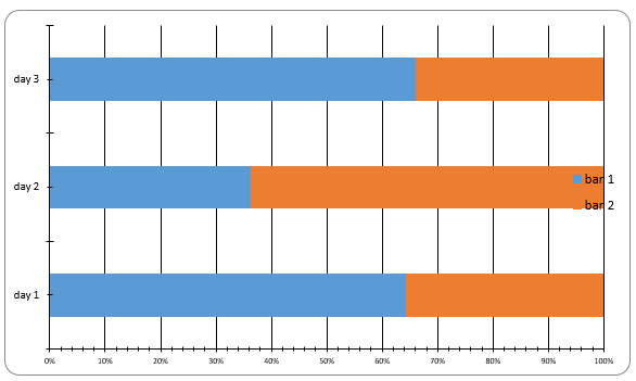
barStackedPercent
This is similar to a bar stacked chart, but the x-axis will be expressed in percentage. For example, the following JSON:
"chart": {
    "bars": [
        {
            "data": [
                {
                    "x": "day 1",
                    "y": "4.3"
                },
                {
                    "x": "day 2",
                    "y": "2.5"
                },
                {
                    "x": "day 3",
                    "y": "3.5"
                }
            ],
            "name": "bar 1"
        },
        {
            "data": [
                {
                    "x": "day 1",
                    "y": "2.4"
                },
                {
                    "x": "day 2",
                    "y": "4.4"
                },
                {
                    "x": "day 3",
                    "y": "1.8"
                }
            ],
            "name": "bar 2"
        }
    ],
    "type": "barStackedPercent"
}
will result in:
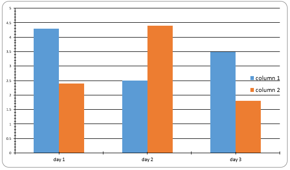
column
This will produce a normal column chart. The chart object should contain an array named columns with objects containing the data and name of the column. E.g.:
"chart": {
    "columns": [
        {
            "data": [
                {
                    "x": "day 1",
                    "y": "4.3"
                },
                {
                    "x": "day 2",
                    "y": "2.5"
                },
                {
                    "x": "day 3",
                    "y": "3.5"
                }
            ],
            "name": "column 1"
        },
        {
            "data": [
                {
                    "x": "day 1",
                    "y": "2.4"
                },
                {
                    "x": "day 2",
                    "y": "4.4"
                },
                {
                    "x": "day 3",
                    "y": "1.8"
                }
            ],
            "name": "column 2"
        }
    ],
    "type": "column"
}
will result in:
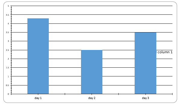
A single column chart can be generated with following JSON:
"chart": {
    "columns": [
        {
            "data": [
                {
                    "x": "day 1",
                    "y": "4.3"
                },
                {
                    "x": "day 2",
                    "y": "2.5"
                },
                {
                    "x": "day 3",
                    "y": "3.5"
                }
            ],
            "name": "column 1"
        }
    ],
    "type": "column"
}
will result in:
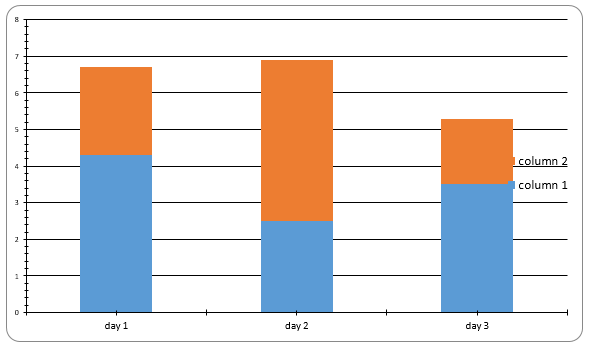
columnStacked
This will produce a column stacked chart. The chart object should contain an array named columns with objects containing the data and the name of the column. E.g:
"chart": {
    "columns": [
        {
            "data": [
                {
                    "x": "day 1",
                    "y": "4.3"
                },
                {
                    "x": "day 2",
                    "y": "2.5"
                },
                {
                    "x": "day 3",
                    "y": "3.5"
                }
            ],
            "name": "column 1"
        },
        {
            "data": [
                {
                    "x": "day 1",
                    "y": "2.4"
                },
                {
                    "x": "day 2",
                    "y": "4.4"
                },
                {
                    "x": "day 3",
                    "y": "1.8"
                }
            ],
            "name": "column 2"
        }
    ],
    "type": "columnStacked"
}
will result in:
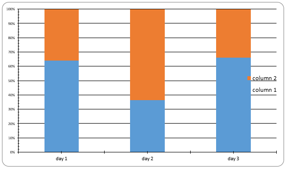
columnStackedPercent
This will produce a column stacked percent chart. The chart object should contain an array named columns with objects containing the data and the name of the column. E.g:
"chart": {
    "columns": [
        {
            "data": [
                {
                    "x": "day 1",
                    "y": "4.3"
                },
                {
                    "x": "day 2",
                    "y": "2.5"
                },
                {
                    "x": "day 3",
                    "y": "3.5"
                }
            ],
            "name": "column 1"
        },
        {
            "data": [
                {
                    "x": "day 1",
                    "y": "2.4"
                },
                {
                    "x": "day 2",
                    "y": "4.4"
                },
                {
                    "x": "day 3",
                    "y": "1.8"
                }
            ],
            "name": "column 2"
        }
    ],
    "type": "columnStackedPercent"
}
will result in:
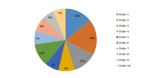
pie and pie3d
This will produce a pie chart. The chart object should contain an array named pies with one element containing the data and name of the pie chart. E.g:
"chart": {
    "pies": [
        {
            "data": [
                {
                    "x": "Order 1",
                    "y": 1890
                },
                {
                    "x": "Order 2",
                    "y": 2380
                },
                {
                    "x": "Order 3",
                    "y": 1640
                },
                {
                    "x": "Order 4",
                    "y": 1090
                },
                {
                    "x": "Order 5",
                    "y": 950
                },
                {
                    "x": "Order 6",
                    "y": 1515
                },
                {
                    "x": "Order 7",
                    "y": 905
                },
                {
                    "x": "Order 8",
                    "y": 1060
                },
                {
                    "x": "Order 9",
                    "y": 730
                },
                {
                    "x": "Order 10",
                    "y": 870
                }
            ],
            "name": "pie 1"
        }
    ],
    "type": "pie"
}
will result in:
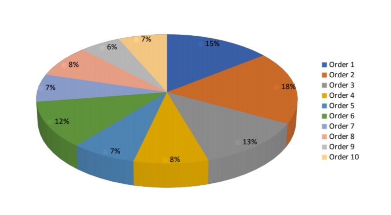
Using "type": "pie3d" gives:
It is possible to supply individual colors for each pie slice. In the above example, the "color" property can be assigned (in CSS notation) for each data point:
{
    "x": "Order 1",
    "y": 1890,
    "color": "#00bfff" // or "DeepSkyBlue", or "rgb(0, 191, 255)" ...
}
If no colors are specified, the document's theme color is used. If some colors are specified, but not for all data points, random colors will fill the gaps.
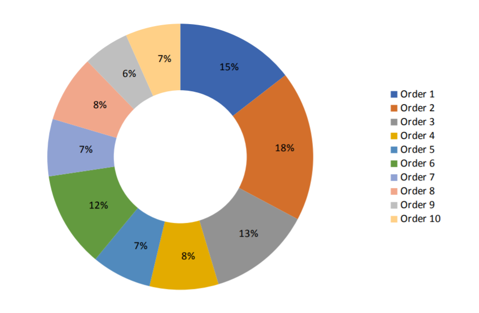
doughnut
This will produce a doughnut chart, similar to the pie chart. The chart object should contain an array named "doughnuts" with one object containing the data and name of the doughnut chart. E.g. :
"chart": {
    "doughnuts": [
        {
            "data": [
                {
                    "x": "Order 1",
                    "y": 1890
                },
                {
                    "x": "Order 2",
                    "y": 2380
                },
                {
                    "x": "Order 3",
                    "y": 1640
                },
                {
                    "x": "Order 4",
                    "y": 1090
                },
                {
                    "x": "Order 5",
                    "y": 950
                },
                {
                    "x": "Order 6",
                    "y": 1515
                },
                {
                    "x": "Order 7",
                    "y": 905
                },
                {
                    "x": "Order 8",
                    "y": 1060
                },
                {
                    "x": "Order 9",
                    "y": 730
                },
                {
                    "x": "Order 10",
                    "y": 870
                }
            ],
            "name": "doughnut 1"
        }
    ],
    "type": "doughnut"
}
will result in:
Like the pie chart, the doughnut chart allows the use of individual colors for each slice. This is documented under the subsection about pie charts above.
radar
This will produce a radar chart. The chart object should contain an array named radars with one element containing the data and name of the radar chart. E.g:
"chart": {
    "radars": [
        {
            "data": [
                {
                    "x": "Order 1",
                    "y": 1240
                },
                {
                    "x": "Order 2",
                    "y": 380
                },
                {
                    "x": "Order 3",
                    "y": 840
                },
                {
                    "x": "Order 4",
                    "y": 490
                },
                {
                    "x": "Order 5",
                    "y": 1230
                }
            ],
            "name": "radar 1"
        }
    ],
    "type": "radar"
}
will result in:
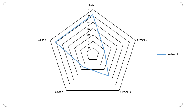
Radar charts, like line charts, support symbols, line styles and custom colors. See the line chart documentation.
area
This will produce an area chart. The chart object should contain an array named areas with one element containing the data and name of the area chart. E.g:
"chart": {
    "areas": [
        {
            "data": [
                {
                    "x": "day 1",
                    "y": "4.3"
                },
                {
                    "x": "day 2",
                    "y": "2.5"
                },
                {
                    "x": "day 3",
                    "y": "3.5"
                }
            ],
            "name": "area 1",
            "color": "green",
            "opacity": 0.3
        },
        {
            "data": [
                {
                    "x": "day 1",
                    "y": "2.4"
                },
                {
                    "x": "day 2",
                    "y": "4.4"
                },
                {
                    "x": "day 3",
                    "y": "1.8"
                }
            ],
            "name": "area 2",
            "color": "rgba(255,80,80,0.5)"
        }
    ],
    "type": "area"
}
will result in:
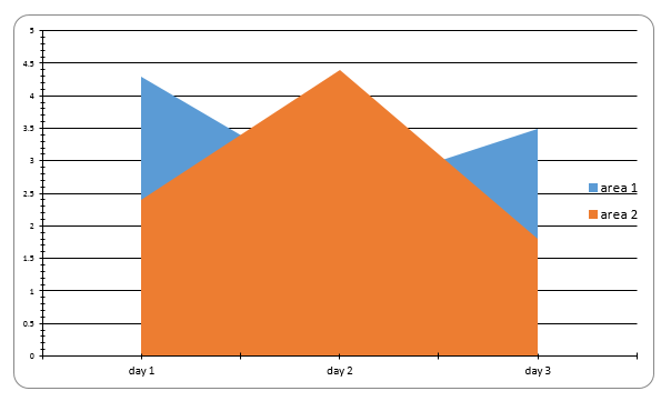
The opacity field sets the area opacity (to a decimal value between 0 and 1). It will only work when a color is manually specified, otherwise it is silently ignored.
The opacity can also be set by using a scheme which includes an alpha value in the color field. Rgba, hsla and hwba are supported.
The opacity field is ignored in that case.
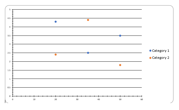
scatter
This will produce a scatter chart. The chart object should contain an array named scatters with one element containing the data and name of the scatter chart. It is similar to the previous charts, however the x-axis should only contain numbers. Example JSON:
"chart": {
    "options": {
        "axis": {
            "x": {
                "type": "number"
            }
        }
    },
    "scatters": [
        {
            "data": [
                {
                    "x": "20",
                    "y": "4.3"
                },
                {
                    "x": "35",
                    "y": "2.5"
                },
                {
                    "x": "50",
                    "y": "3.5"
                }
            ],
            "name": "Category 1"
        },
        {
            "data": [
                {
                    "x": "20",
                    "y": "2.4"
                },
                {
                    "x": "35",
                    "y": "4.4"
                },
                {
                    "x": "50",
                    "y": "1.8"
                }
            ],
            "name": "Category 2"
        }
    ],
    "type": "scatter"
}
will result in:
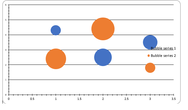
bubble
This will produce a bubble chart. The chart object should contain an array named bubbles with one element containing the data and the name of the bubble chart. It is similar to previous charts however, the data points can now contain a size value to determine the size of a bubble. Example JSON:
"chart": {
    "bubbles": [
        {
            "data": [
                {
                    "x": "day 1",
                    "y": "4.3",
                    "size": "1"
                },
                {
                    "x": "day 2",
                    "y": "2.5",
                    "size": "3"
                },
                {
                    "x": "day 3",
                    "y": "3.5",
                    "size": "2"
                }
            ],
            "name": "Bubble series 1"
        },
        {
            "data": [
                {
                    "x": "day 1",
                    "y": "2.4",
                    "size": "4"
                },
                {
                    "x": "day 2",
                    "y": "4.4",
                    "size": "5"
                },
                {
                    "x": "day 3",
                    "y": "1.8",
                    "size": "1"
                }
            ],
            "name": "Bubble series 2"
        }
    ],
    "type": "bubble"
}
will result in:
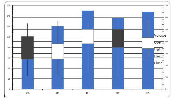
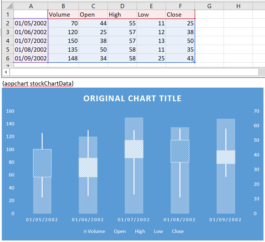
stock
The chart object should contain an array named stocks with one element containing the data and the name of the stock chart. Here instead of an y-value: the volume, open, close, high and low value should be given. The format of the x-axis is optional. The x-axis contains the starting date using 1900 notation, i.e. 1 will represent January 1 1900 more info.
Example:
"chart": {
    "stocks": [
        {
            "data": [
                {
                    "x": "1",
                    "volume": "70",
                    "open": "44",
                    "high": "55",
                    "low": "11",
                    "close": "25"
                },
                {
                    "x": "2",
                    "volume": "120",
                    "open": "25",
                    "high": "57",
                    "low": "12",
                    "close": "38"
                },
                {
                    "x": "3",
                    "volume": "150",
                    "open": "38",
                    "high": "57",
                    "low": "13",
                    "close": "50"
                },
                {
                    "x": "4",
                    "volume": "135",
                    "open": "50",
                    "high": "58",
                    "low": "11",
                    "close": "35"
                },
                {
                    "x": "5",
                    "volume": "148",
                    "open": "34",
                    "high": "58",
                    "low": "25",
                    "close": "43"
                }
            ],
            "name": "s"
        }
    ],
    "type": "stock",
    "options": {
        "axis": {
            "x": {
                "date": {
                    "unit": "days",
                    "step": 1,
                    "code": "dd"
                }
            }
        }
    },
    "name": "Stocks"
}
will result in:
Combining Charts
It is possible to combine multiple charts. For example, a column and a line chart. If a second value axis is wished on the right side, then the values should be given as y2 instead of y. The type should be "multiple" and the chart should contain a multiples array which contains the different charts defined previously. It is possible to combine more than 2 types of chart but there can only be two value axes. An example is given below:
"chart": {
    "multiples": [
        {
            "columns": [
                {
                    "data": [
                        {
                            "x": "day 1",
                            "y": "4.3"
                        },
                        {
                            "x": "day 2",
                            "y": "2.5"
                        },
                        {
                            "x": "day 3",
                            "y": "3.5"
                        }
                    ],
                    "name": "bar 1"
                },
                {
                    "data": [
                        {
                            "x": "day 1",
                            "y": "2.4"
                        },
                        {
                            "x": "day 2",
                            "y": "4.4"
                        },
                        {
                            "x": "day 3",
                            "y": "1.8"
                        }
                    ],
                    "name": "bar 2"
                }
            ],
            "type": "column"
        },
        {
            "lines": [
                {
                    "data": [
                        {
                            "x": "day 1",
                            "y2": "43"
                        },
                        {
                            "x": "day 2",
                            "y2": "25"
                        },
                        {
                            "x": "day 3",
                            "y2": "35"
                        }
                    ],
                    "name": "line 1"
                },
                {
                    "data": [
                        {
                            "x": "day 1",
                            "y2": "24"
                        },
                        {
                            "x": "day 2",
                            "y2": "44"
                        },
                        {
                            "x": "day 3",
                            "y2": "18"
                        }
                    ],
                    "name": "line 2"
                }
            ],
            "type": "line"
        }
    ],
    "options": {
        "border": true,
        "grid": true,
        "height": 700,
        "legend": {
            "position": "r",
            "showLegend": true
        },
        "title": false,
        "width": 500
    },
    "type": "multiple"
}
will result in:
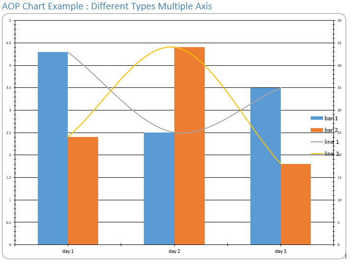
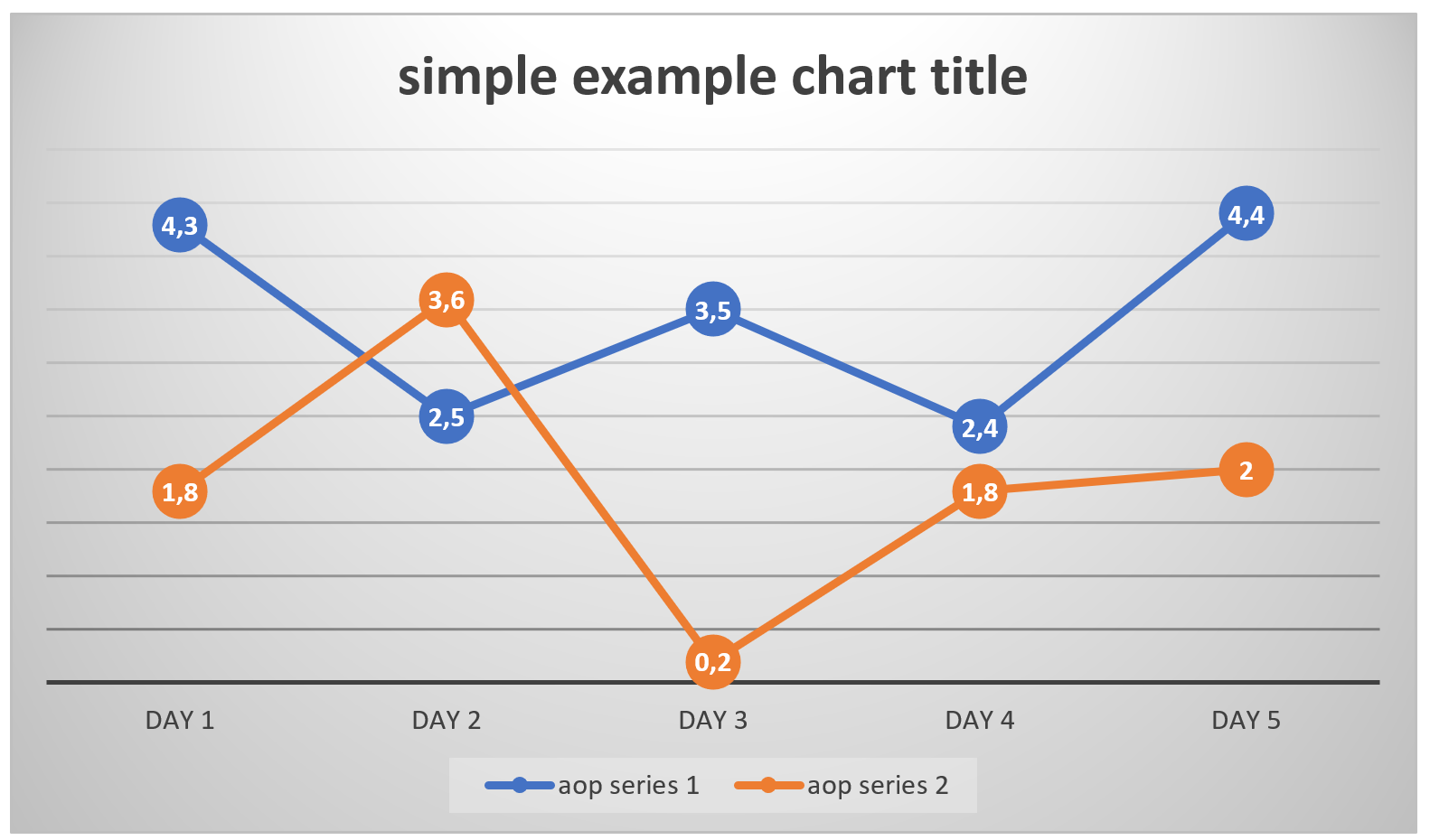
Chart Templating
There is another way to create charts. You can provide a chart in the template and mark it with a preceding {copchart chartData}, where copchart is the tag identifier and chartData is the object in the data which contains information about the chart. Using this method, the chart in the template can be styled through MS Office or LibreOffice as an alternative to passing the style options as a part of the input data. This allows the use of style options we do not support, but moves the chart styling from the data to the template (e.g. loops containing a chart with different style on each iteration would not be possible using this tag). The data is specified per series and all options are given in the example below.
The JSON data for a simple example looks like:
"simpleChartData": {
    "title": "simple example", // chart title
    "xAxis": {
        "data": ["day 1", "day 2", "day 3", "day 4", "day 5"]
        // instead of arrays of string, the data can be an object with a value attribute
        // alternatively:
        // "data": [{"value": "day 1"}, {"value": "day 2"}, {"value": "day 3"}, {"value": "day 4"}, {"value": "day 5"}]
    },
    "yAxis": {
        "series": [
            // list of series, each with a name
            {
                "name": "cop series 1",
                "data": [4.3, 2.5, 3.5, 2.4, 4.4]
                // instead of arrays of number, the data can be an object with a value attribute
                // alternatively:
                // "data": [{"value":4.3}, {"value":2.5}, {"value":3.5}, {"value":2.4}, {"value":4.4}]
            },
            {
                "name": "cop series 2",
                "data": [1.8, 3.6, 0.2, 1.8, 2]
                // instead of arrays of number, the data can be an object with a value attribute
                // alternatively:
                //" data": [{"value":1.8}, {"value":3.6}, {"value":0.2}, {"value":1.8}, {"value":2}]
            }
        ]
    }
}
Note that the x-axis gets one nameless serie, directly as "data" instead of in a "series" array. The names of the series are those used as legend entries.
If more series are provided in the data than are present in the template, the extra series from the data are ignored. If there are more series in the template, the extra series from the template are removed in the output file.
With the above data, the template:
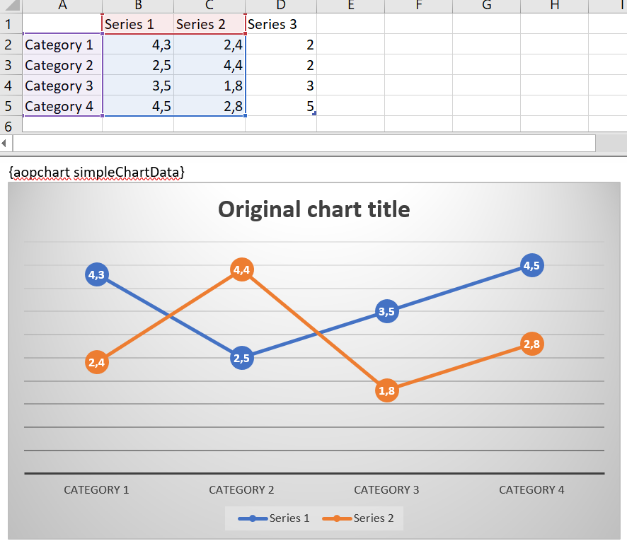
will result in
It is possible to use both the secondary x-axis and the secondary y axis. The secondary x and y axes can only receive a title in the data. The secondary y-axis can be utilized by assigning the corresponding series to the y-axis in the template.
"simpleChartDataWithSecondaryAxes": {
    "title": "example with secondary axes",
    "xAxis": {
        "title": "cop x ax title",
        "data": [1, 2, 3, 4, 5]
    },
    "yAxis": {
        "title": "cop y ax title",
        "series": [
            {
                "name": "cop series 1",
                "data": [5, 4, 7, 8, 6]
            },
            {
                "name": "cop series 2",
                "data": [4, 8, 7, 6, 3]
            },
            {
                "name": "cop series 3",
                "data": [2, 4, 4, 1, 6]
            }
        ]
    },
    "x2Axis": {
        "title": "cop x2 ax title"
    },
    "y2Axis": {
        "title": "cop y2 ax title"
    }
}
With the above data, the template:
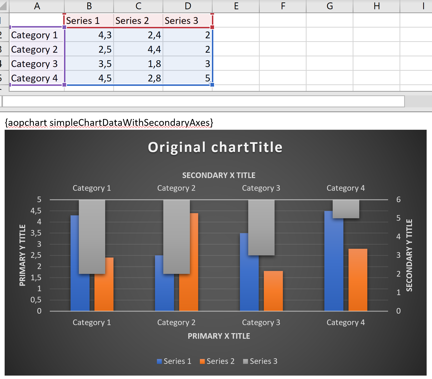
will result in
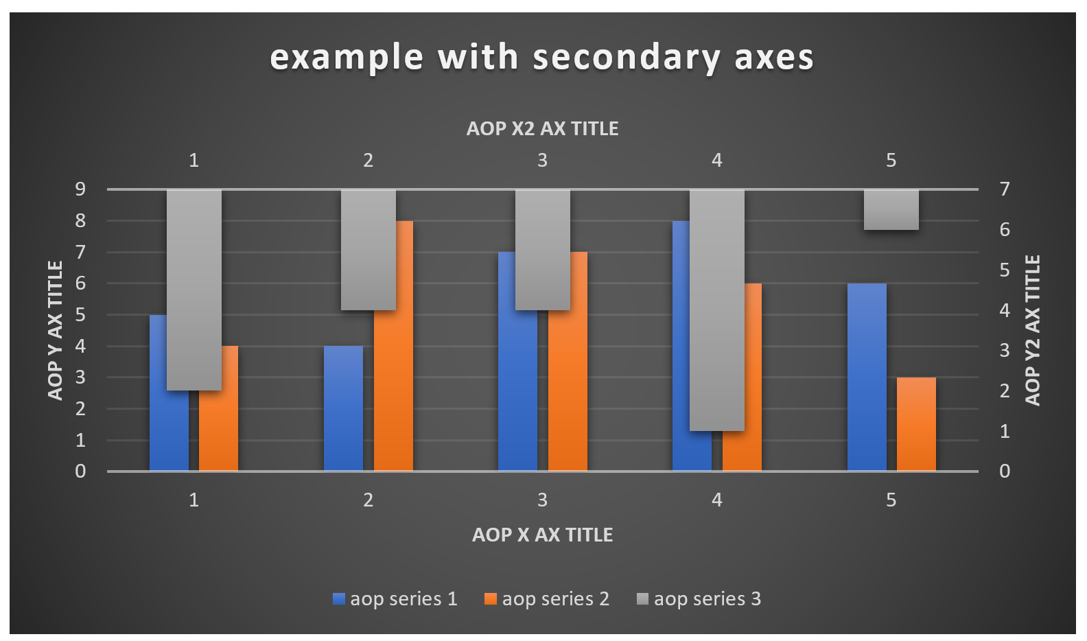
Note that there is not much use in showing a secondary x-axis, since it shows the same values with a different title.
When replacing titles, both for the chart title and the axis titles, it is recommended to edit them to something else than the default values in the template. This is because, in MS Office, when the title is at its unchanged default value, neither the title text nor its styling is actually included in the document yet. The actual styling is thus still up for interpretation and the title will look different in MS Office and LibreOffice. If the titles are the same as their default value, we generate the same title styling as the one we use by default for the {$chart} tag.
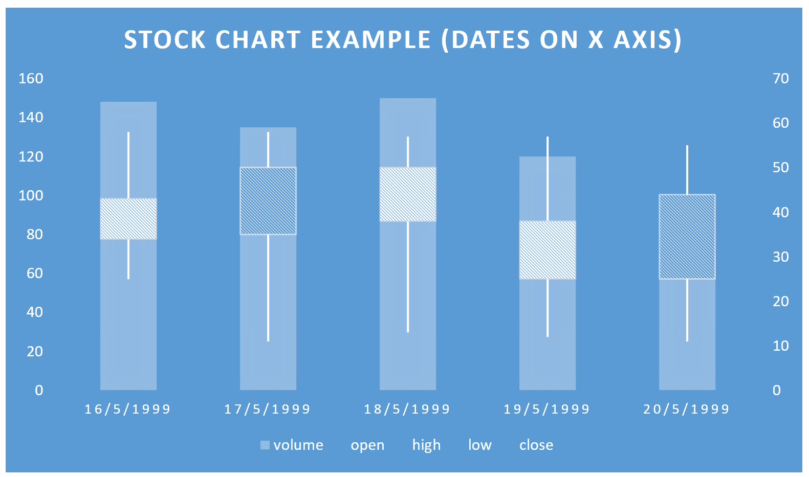
If the x-axis contains dates in the template and receives an additional date object in the data, its series are treated as a series of dates. These should match an ISO 8601 format, the RFC 2822 Date time format or UNIX Epoch Time. This date object contains:
"format": the format to display the date on the chart's axis."unit": the unit to be used for spacing the axis values."step": how many of the above unit should be used for spacing the axis values (automatic if undefined). This option is not supported in LibreOffice.
The unit cannot be determined automatically. E.g. if the unit was not specified as "days" in the data below, the result would just show a single bar for May 1999, since the unit in the template is clearly "months".
"stockChartData": {
    "title": "stock chart example (dates on x-axis)",
    "xAxis": {
        "date": {
            "format": "d/m/yyyy",
            "unit": "days",
            "step": "1"
        },
        "data": [
            "1999-05-16",
            "1999-05-17",
            "1999-05-18",
            "1999-05-19",
            "1999-05-20"
        ]
    },
    "yAxis": {
        "series": [
            {
                "name": "volume",
                "data": [148, 135, 150, 120, 70]
            },
            {
                "name": "open",
                "data": [34, 50, 38, 25, 44]
            },
            {
                "name": "high",
                "data": [58, 58, 57, 57, 55]
            },
            {
                "name": "low",
                "data": [25, 11, 13, 12, 11]
            },
            {
                "name": "close",
                "data": [43, 35, 50, 38, 25]
            }
        ]
    }
}
With the above data, the template:
will result in
D3 (Data Driven Documents) Images
With Word/Excel/PowerPoint documents, it's possible to let Cloud Office Print execute some JavaScript code to generate a D3 image.
Given the JSON file with following content:
{
    "files": [
        {
            "filename": "output",
            "data": {
                "test": "CODE"
            }
        }
    ]
}
With as (JSON-encoded) code:
// Based on https://bl.ocks.org/mbostock/7f5f22524bd1d824dd53c535eda0187f
const d3 = require('d3');
const D3Node = require('d3-node');
const d3n = new D3Node();

const svg = d3n.createSVG(512, 512);
const [width, height] = [512, 512];
const margin = { top: 20, right: 30, bottom: 30, left: 40 };

var x = d3
    .scaleLog()
    .domain([2e-1, 5])
    .rangeRound([margin.left, width - margin.right]);
var y = d3
    .scaleLog()
    .domain([3e2, 2e4])
    .rangeRound([height - margin.bottom, margin.top]);
var color = d3.scaleSequential(d3.interpolateYlGnBu).domain([0, 1.8]); // Points per square pixel.

svg.append('g')
    .attr('transform', 'translate(0,' + (height - margin.bottom) + ')')
    .call(d3.axisBottom(x).ticks(null, '.1f'))
    .select('.tick:last-of-type text')
    .select(function () {
        return this.parentNode.appendChild(this.cloneNode());
    })
    .attr('y', -3)
    .attr('dy', null)
    .attr('font-weight', 'bold')
    .text('Carats');

svg.append('g')
    .attr('transform', 'translate(' + margin.left + ',0)')
    .call(d3.axisLeft(y).ticks(null, '.1s'))
    .select('.tick:last-of-type text')
    .select(function () {
        return this.parentNode.appendChild(this.cloneNode());
    })
    .attr('x', 3)
    .attr('text-anchor', 'start')
    .attr('font-weight', 'bold')
    .text('Price (USD)');

d3.tsv(
    'https://bl.ocks.org/mbostock/raw/7f5f22524bd1d824dd53c535eda0187f/diamonds.tsv',
    (d) => ({ carat: +d.carat, price: +d.price }),
    (error, diamonds) => {
        if (error) throw error;
        if (diamonds[0] instanceof Error) throw diamonds[0];
        svg.insert('g', 'g')
            .attr('fill', 'none')
            .attr('stroke', '#000')
            .attr('stroke-width', 0.5)
            .attr('stroke-linejoin', 'round')
            .selectAll('path')
            .data(
                d3
                    .contourDensity()
                    .x((d) => x(d.carat))
                    .y((d) => y(d.price))
                    .size([width, height])
                    .bandwidth(10)(diamonds),
            )
            .enter()
            .append('path')
            .attr('fill', (d) => color(d.value))
            .attr('d', d3.geoPath());
        finish(d3n);
    },
);
A Word document containing {$d3 test} would produce the following result:
Should a field "test_data": [1,2,3] be present in the JSON (at the same place as "test": "CODE"), then the code will have access to the global data which would be [1,2,3], or whatever "test_data" is. Strings, booleans, nunbers and objects are also possible.
Code Structure
This is how the code is supposed to be organized:
// Import D3
const d3 = require('d3');
// Import D3-Node
const D3Node = require('d3-node');
// Instantiate a new D3Node, which will provide the SVG and will be required to finish
const d3n = new D3Node();
// Create a SVG (instead of selecting one from the (here non-existing) document)
const svg = d3n.createSVG(512, 512); // Different sizes are possible
// Start working on the SVG
svg.append('g').text('Test');
//  etc
// We can access the _data field if it was given:
svg.append('g').text(data ? data.toString() : 'No data passed!');
// When the SVG is finished, call the global finish() with the used D3Node object
finish(d3n);
// We can also call the global fail() (or throw an error) should something fail:
fail(new Error('We are missing something!'));
Specifications and Limitations
- The version of the d3 library is 4.12.0
- d3-contour and d3-scale-chromatic (along with all default 4.12.0 submodules) are preloaded, e.g.
d3.contour()is available - The code is run in an async environment, meaning
awaitis available - The code has to either have a return statement with a D3Node object, or call finish() with one
- After the code has successfully finished, the SVG will be extracted from the D3Node, converted to PNG and pasted in the Word/Excel/...
- ES2015, ES2016 and ES2017 are supported, run inside a Node environment
- Only d3 libraries (including sub-libraries like d3-polygon) can be returned by require()
- d3-request can only use http:// and https:// URLs
- There are time limitations, e.g. the whole script will time out after 30s, even when it's still fetching data over HTTP(S)
- All errors are caught and will cause the whole PrintJob to fail. The stack trace will be shown
Simple Angular Like Expressions
Simple angular like expressions are also supported that can perform simple mathematical operations.
A full list of Angular expressions can be found at docs.angularjs.org/guide/expression.
Simple Expressions
Expressions like {num1 + num2} will print the sum of num1 and num2. Division, multiplication, addition and subtraction are allowed.
If the given key has a boolean value then you can use {#boolean key}…{/boolean key} to print the content inside the tags if the value of the boolean key is true. For negation {^boolean key}…{/boolean key} is used. The content inside these tags will be printed if the boolean key has false as value or if the boolean key does not exists or if the boolean key is an empty array.
String/Number Comparison
You can also check the value of keys with {#key=='value'}…{/key=='value'}. The content inside the tags will be only printed if the value of the key is equal to "value". Note here in {#key=='value'}, that straight single quotes are used!
Numbers can also be compared in the same way as strings {#key>50}…{/key>50}.The content inside the tags will be only printed if the value of the key is greater than 50. The following operators are supported: <, >, <=, >=, ==, !=
Conditional and Comparison operator
Another way to compare variables is as follows: {key == 'value' ? key2 : key3}. This way other keys/variables can also be inserted. This will print out value of key2 if the expression is true and key3 if the expression is false.
Possible conditional operators are:
- Equal: == (equal to) or === (equal value and equal type)
- Not Equal: != or !== (not equal value or not equal type)
- And: &&
- Or: ||
- Greater than: >
- Less than: <
- Greater than or equal: >=
- Less than or equal: <=
Conditional Example
For the JSON given in example below {currency == 'EUR' ? '€'+price : price+'$'} prints €50 if true and 50$ if false and given price variable is 50.
Given the JSON file with following content:
{
    "data": [
        {
            "product": [
                {
                    "product_name": "Business Shirt",
                    "quantity": 3,
                    "unit_price": 50,
                    "onstock": true,
                    "cur": "EUR"
                },
                {
                    "product_name": "Trousers",
                    "quantity": 3,
                    "unit_price": 80,
                    "onstock": false,
                    "cur": "USD"
                },
                {
                    "product_name": "Jacket",
                    "quantity": 3,
                    "unit_price": 15,
                    "onstock": true,
                    "cur": "USD"
                },
                {
                    "product_name": "Blouse",
                    "quantity": 3,
                    "unit_price": 60,
                    "onstock": false,
                    "cur": "EUR"
                }
            ]
        }
    ]
}
and template with following content:
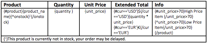
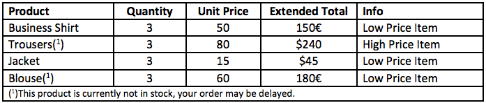
will result in:
Angular expressions can also be used inside floating texts. Below an example where the images are put inside a floating textbox and are shown under condition.
String Operations
If your tag resolves to a string then you can also use string manipulation functions like: substr, length, substring, replace, split. see prototype methods developer.mozilla.org/en-US/docs/Web/JavaScript/Reference/Global_Objects/String
Array Operations
If your tag resolves to an array, i.e for using with a {#loop} tag. You can access the length of the loop array by .length property for example {loop.length}. You can also access individual array elements with the array access notation of Javascript, for example {loop[0].loop_inside_element}.
Number formatting
It is possible to format numbers using angular expressions. The following formats are supported:
'FML999G999G999G999G990D00';
'FML999G999G999G999G990';
'999G999G999G999G990D00';
'999G999G999G999G990D0000';
'999G999G999G999G999G999G990';
'999G999G999G999G990D00MI';
'S999G999G999G999G990D00';
'999G999G999G999G990D00PR';
'FML999G999G999G999G990PR';
Use the following structure (the following is showing how to format the number given by unit_price):
{tag|format:formatMask:decimalSeparators:currency} concrete:
{unit_price|format:"FML999G999G999G999G990D00":".,":"$"}
The only required argument is the format mask. The default value for decimalSeparators is ".," and "$" is the default value for the currency. Please note that the format mask, decimal separators and currency can also be provided via a variable. For example the given data will also work:
{
    "unit_price": 180,
    "mask": "S999G999G999G999G990D00",
    "decimal": ",.",
    "cur": "$"
}
and the tag to be used is:
{unit_price|format:mask:decimal:cur}
Please note that the value returned will be a string. To get the native formatting in excel please use the {tag$} style tag.
Date Formatting
It is possible to format date/time strings using angular expressions.
The structure to use is {date_data|format_date:formatMask:timeZone} where:
- The JSON data contains a
"date_data"field (arbitrarily named), in ISO 8601 format. Note that this format allows the inclusion of time zone info in the form of a UTC offset. formatMaskis a format mask which will determine how the output is formatted. The supported format masks are the Oracle Datetime format models.timeZoneis an optional standard time zone identifier like"Europe/Brussels"or"America/Los_Angeles"(complete list). If the output time zone is not specified, the output will use the same time zone as the input (as in the first example tag below). Given an invalid time zone,"Etc/UTC"is used.
For example, the tags
{D1|format_date:"D-MM-YY HH24:MI:SS"} {D2|format_date:"DD/Mon/YYYY"}
{D3|format_date:"DD-MM-YYYY HH24:MI:SS"} {D3|format_date:"DD-MM-YYYY
HH24:MI:SS":"America/Argentina/Tucuman"} {D4|format_date:"DD-MM-YYYY
HH24:MI:SS"} {D4|format_date:"DD-MM-YYYY HH24:MI:SS":"Asia/Kathmandu"}
{D4|format_date:"DD-MM-YYYY HH24:MI:SS":"America/Los_Angeles"}
with data
{
    "D1": "2020-07-13T20:01:11Z-03:00",
    "D2": "1999-05-16T10:01:11Z+05:00",
    "D3": "2020-07-13T00:00:00Z",
    "D4": "1999-05-16T23:00:00+00:00"
}
will result in:
13-07-20 20:01:11
16/MAY/1999
13-07-2020 00:00:00
12-07-2020 21:00:00
16-05-1999 23:00:00
17-05-1999 04:45:00
16-05-1999 16:00:00
Labels Printing
Cloud Office Print also provides a way to print labels in Word documents. To do so you can create a document with labels by going to Mailings options and then to Labels. Fill in the tags in the address field and choose the type of label in the Label option. A document can then be generated by clicking New document. Currently however if labels are getting printed then we expect the document only containing labels and no other information, and that the tag keys are not used more than once. Given the JSON file:
"data": {
    "labels": [
        {
            "Title": "Mr",
            "FirstName": "Albert",
            "LastName": "Lambert",
            "JobTitle": "Developer",
            "Company": "United Codes",
            "Address1": "10701 Lambert International Blvd.",
            "City": "St. Louis",
            "State": "MO",
            "PostalCode": 63145,
            "Country": "US",
            "HomePhone": "314-555-4022"
        },
        ...
        {
            "Title": "Mr",
            "FirstName": "Edward",
            "LastName": "Logan",
            "JobTitle": "Developer",
            "Company": "United Codes",
            "Address1": "1 Harborside Drive",
            "City": "East Boston",
            "State": "MA",
            "PostalCode": "02128",
            "Country": "US",
            "HomePhone": "617-555-3295"
        }
    ]
}
and template (template generation video):
will produce:
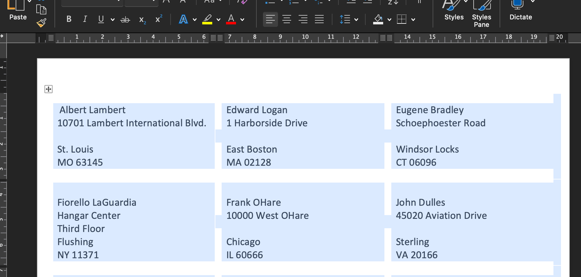
Note that in the first cell you need to add the {-labels} tag. See also the Sample app.
Page Breaks
Appyling page breaks to your Word file is possible by means of {?pageBreakTag}. pageBreakTag refers to a variable name that is placed in the json file. Value of pageBreakTag should be set to page or pagebreak for PageBreak, column or columnbreak for column breaks, if set to true (default) it will create a pagebreak;
Given the template below,

with the json file,
...
"pageBreakTag" : "true" // or true as boolean or any value specified above
...
Output would look like this in the word page break preview:

HTML Tag
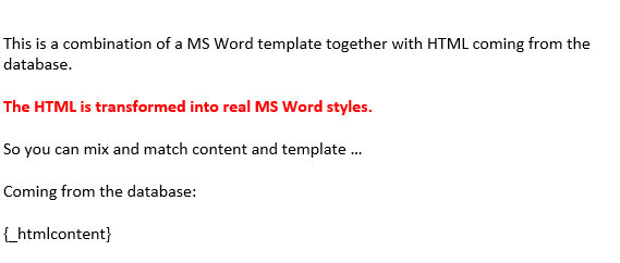
HTML tags can also be converted to Word. The tag that has to be used is {_key}, thus underscore followed by the key which has HTML content in the JSON. The tags that are currently supported are:
<br />
<!-- : in order to introduce breaks (newline) -->
<p>...</p>
<!-- : represents a paragraph -->
<strong>...</strong>
<!-- : bold text -->
<b>...</b>
<!-- : bold text -->
<s>...</s>
<!-- : strike through -->
<u>...</u>
<!-- : underline -->
<em>...</em>
<!-- : italics -->
<h1>...</h1>
<!-- : heading 1 -->
<h2>...</h2>
<!-- : heading 2 -->
<h3>...</h3>
<!-- : heading 3 -->
<h4>...</h4>
<!-- : heading 4 -->
<h5>...</h5>
<!-- : heading 5 -->
<h6>...</h6>
<!-- : heading 6 -->
<sub>...</sub>
<!-- : subscript -->
<sup>...</sup>
<!-- : superscript -->
<ol>
    ...
</ol>
<!-- : ordered list -->
<ul>
    ...
</ul>
<!-- : unordered list -->
<li>...</li>
<!-- : list item -->
<table>
    ...
</table>
<!-- : table (including th, tr, td) -->
<caption>
    ...
</caption>
<!-- : caption -->
<img />
<!-- : image -->
<pre>...</pre>
<!-- : preformatted text -->
<blockquote>...</blockquote>
<!-- : quoting for multiple lines -->
<q>...</q>
<!-- : quoting for single line -->
<dfn>...</dfn>
<!-- : definition element -->
<span style="...">...</span>
<!-- : text between the span will have the style defined, background-color, color, font-size and font-family are supported. -->
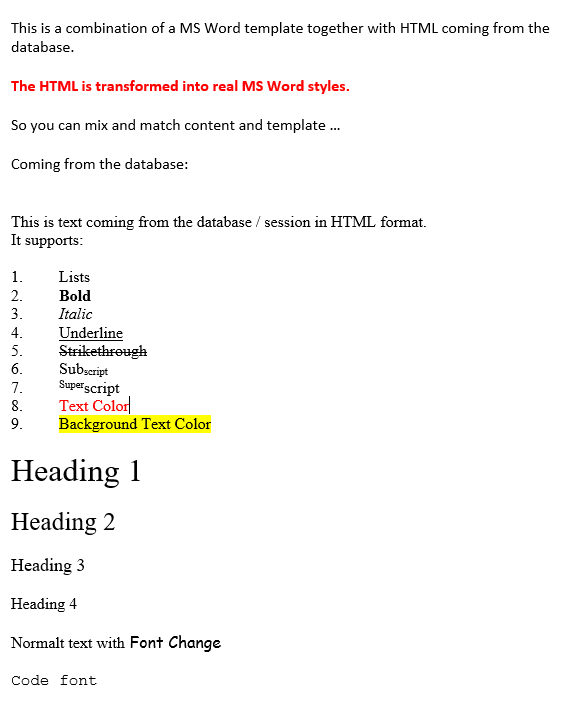
E.g. : given the following key inside the data:
{
    "htmlcontent": "<p>This is text coming from the database / session in HTML format.
<br />It supports:
</p>
<ol>
<li>Lists</li>
<li><strong>Bold</strong></li>
<li><em>Italic</em></li>
<li><u>Underline</u></li>
<li><s>Strikethrough</s></li>
<li>Sub<sub>script</sub></li>
<li><sup>Super</sup>script</li>
<li><span style=\"color:#FF0000\">Text Color</span></li>
<li><span style=\"background-color:#FFFF00\">Background Text Color</span>
</li>
</ol>
<h1>Heading 1</h1>
<h2>Heading 2</h2>
<h3>Heading 3</h3>
<h4>Heading 4</h4>
<p>Normalt text with<span style=\"font-family:comic sans ms,cursive\"> Font Change</span></p>
<p><span style=\"font-family:courier new,courier,monospace\">Code font</span>
</p>"
}
and the template:
will produce:
Table
Cloud Office Print supports the HTML table tag. Supported table elements are:
<table>
    ...
</table>
<tr>
    ...
</tr>
<th>...</th>
<td>...</td>
<thead>
    ...
</thead>
<tbody>
    ...
</tbody>
<tfoot>
    ...
</tfoot>
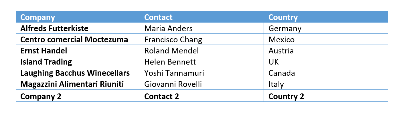
The <thead> tag defines the header row and the <tfoot> tag defines the "total row". The following HTML table, provided inside a JSON file as the value for {_htmlContent}
<table>
    <thead>
        <tr>
            <th>Company</th>
            <th>Contact</th>
            <th>Country</th>
        </tr>
    </thead>
    <tbody>
        <tr>
            <td>Alfreds Futterkiste</td>
            <td>Maria Anders</td>
            <td>Germany</td>
        </tr>
        <tr>
            <td>Centro comercial Moctezuma</td>
            <td>Francisco Chang</td>
            <td>Mexico</td>
        </tr>
        <tr>
            <td>Ernst Handel</td>
            <td>Roland Mendel</td>
            <td>Austria</td>
        </tr>
        <tr>
            <td>Island Trading</td>
            <td>Helen Bennett</td>
            <td>UK</td>
        </tr>
        <tr>
            <td>Laughing Bacchus Winecellars</td>
            <td>Yoshi Tannamuri</td>
            <td>Canada</td>
        </tr>
        <tr>
            <td>Magazzini Alimentari Riuniti</td>
            <td>Giovanni Rovelli</td>
            <td>Italy</td>
        </tr>
    </tbody>
    <tfoot>
        <tr>
            <td>Company 2</td>
            <td>Contact 2</td>
            <td>Country 2</td>
        </tr>
    </tfoot>
</table>
will result in the following Word table:
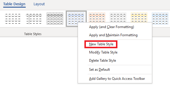
While creating a template for an HTML table we can specify a table style. We can do this either by creating a new design and naming it as "customTable":
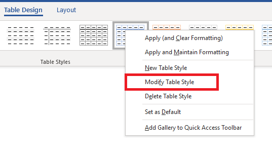
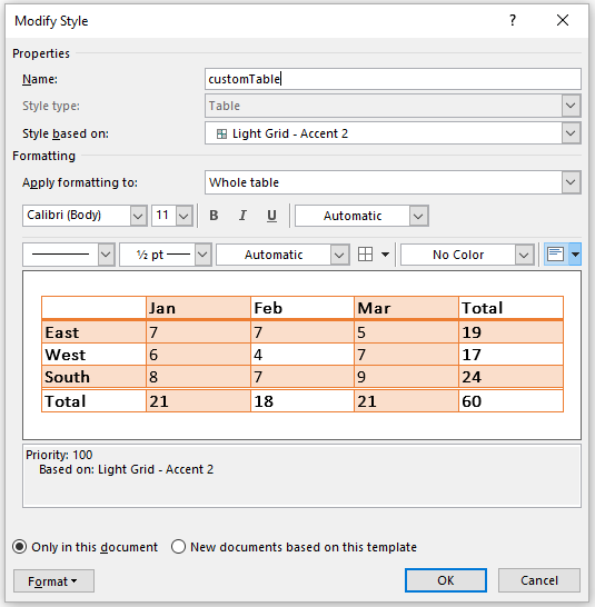
or by modifying an existing table style and giving an alias to that table.
The output of the following JSON content with the above HTML table will be as follows :
{
    "htmlContent": "/.... table content here ..../",
    "htmlContent_custom_table_style": "customTable"
}
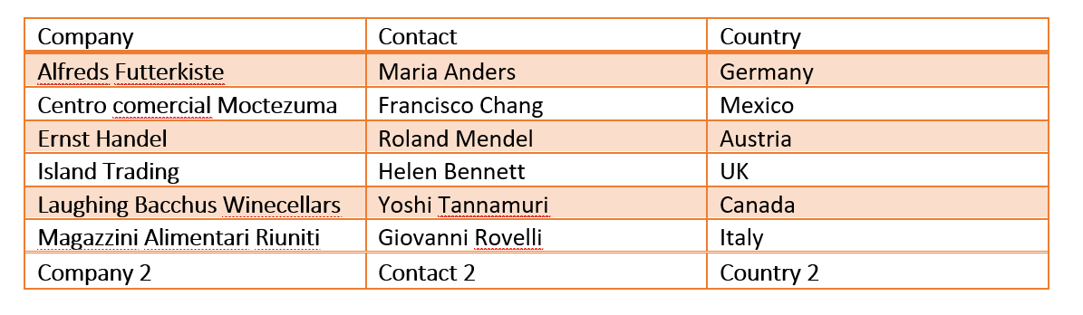
Ordered Lists and Unordered Lists
Cloud Office Print supports <ol> and <ul> tags. These two tags can be nested. Below here is an example of the usage of these two tags.
<ol>
    <li>
        Level 1.1
        <ul>
            <li>Level 2.1</li>
            <li>
                Level 2.2
                <ol>
                    <li>Level 3.1</li>
                    <li>Level 3.2</li>
                </ol>
            </li>
        </ul>
    </li>
    <li>Level 1.2</li>
    <li>Level 1.3</li>
</ol>
The output of this code would look like below picture.
Word is capable of changing the styling of the symbols for <ol> and <ul> tags. This can be achieved through adding an additional parameter to the json file provided. For the <ol> tag this is _ordered_list_style and for the <ul> tag this is _unordered_list_style. These properties take numeric values. These values are defined as follows:
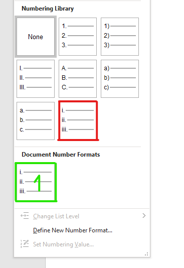
If the styling in the red box choosed that would correspond to styling number 1 which is indicated in the "Document Number Formats" with green box. If another style were to choosen that would have style number 2.
In short every added style is enumarated starting from 1. For example if the below JSON is provided with the above HTML code,
{
    "htmlContent": "......",
    "htmlContent_ordered_list_style": "1"
}
it would result in the following file.
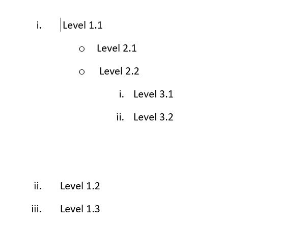
Right to Left Tag
In Word, when substituting the content in a language written in right to left like Arabic, the {<rightToLeft} tag can be used to properly format the language. If the substituting content does not contain any right to left language character, then it will behave as a normal substitution tag.
Footnote Tag
A footnote tag can be used to insert a footnote. The tag should start with the "+" symbol. For example, given the following template:

and the data as follows:
{
    "quote": "Only I can change my life. No one can do it for me.",
    "person": "Carol Burnett"
}
will result in:

Hyperlink Tag
Hyperlinks can be inserted using the a tag starting with a "*" symbol e.g: {*hyperlink}. Given the template:

And the data:
{
    "name": "Support",
    "company_url": "https://www.cloudofficeprint.com",
    "company_url_text": "United Codes",
    "mail": "support@cloudofficeprint.com"
}
will result in:

The mail hyperlinks are automatically detected and mailto: will be appended for the link to work. The hyperlink text can be given by giving extra data that ends with _text. e.g: {*tag_text}. (see json above).
This hyperlink will also work when the chosen output is PDF.
Please note that in Excel the hyperlinks will be added but the style will remain normal. You can change the tag style in the template if another styling is desired. In Word your default hyperlink styling will be taken. If you wish another styling, you can change the style of the tag and add thetag_preserve_tag_style:true option in the data.
{*link name:uid} / {*target name:uid}
This tag allows you to place a link to a target inside the same document. To point a link tag to its target both of these tags should have same unique id (uid). If the uid is not provided, a new uid will be generated uniquely for every different link and target pair having the same value after the space in the tag.
-
{*link name:uid} is a tag where a link will be placed. The tag itself will be replaced by the value of key after the space, in this case the value of name. This can also be for example: {*link "Click here":1}. This will link or redirect to the section where a target tag is placed with the same uid. Multiple link tag may target one target tag. But one link tag cannot target multiple target tags.
-
{*target name:uid} is a tag where a bookmark will be placed and is thus the target of link tag having same unique id. The replacing value will be determined by the key after space, in this case, name. This is a variable and can be for example: {*target "To go here":1}.
Below in template {*link invoicenumber:number} and {*target invoicenumber:number} where 'number' specifies the uid.
{
    "invoicenumber": [
        {
            "invoicenumber": "984562135456",
            "number": "1"
        },
        {
            "invoicenumber": "221304521445",
            "number": "2"
        },
        {
            "invoicenumber": "784512364512",
            "number": "3"
        }
    ]
}
with template
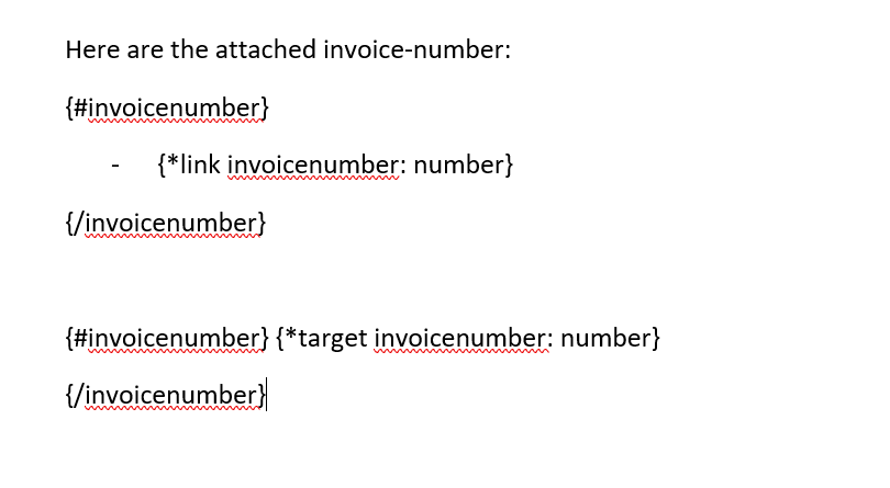
will result in:
Here the uid number is not really necessary as the our replacing value is already unique. So our pairs could have been {*link invoicenumber} and {*target invoicenumber}.
Table of Content
Placing the {~tockey} tag will generate table of content at the place where this tag is used. Cloud Office Print allows you to customize the table of content. The following options are available:
{
    "tockey_title": "Title of Table Of Content", //Default Contents
    "tockey_show_level": 3, //The depth of heading to be shown, default 3
    "tockey_tab_leader": "underscore" //How the space between title and page number should be filled. Can be "hyphen", "underscore", or "dot" (default).
}
Please note that the table of content will not contain the page numbers as Cloud Office Print itself does not render the document. This page numbers should be automatically updated if your output is PDF and if you are using OfficeToPdf as PDF converter. You can also make use of Libreoffice Basic Macro to update the table of content.
Hereby the steps to add the macro to update the table of contents and convert the document to PDF using LibreOffice:
-
Open Libreoffice
-
Go to Tools menu => Macros => Organize Macro => Libreoffice Basic
-
Select My Macros => Standard => Module1 and select Edit
-
Add the following subroutine (method)
sub updateAndConvert(sDocUrl as string)

dim oDocument as object
dim dispatcher as object

dim propExp(0) as new com.sun.star.beans.PropertyValue

dim sNewUrl as string

if fileExists(sDocUrl) then
    oDocument = starDesktop.loadComponentFromUrl(convertToUrl(sDocUrl), "_blank", 0, array())

    dispatcher = createUnoService("com.sun.star.frame.DispatchHelper")
    dispatcher.executeDispatch(oDocument.CurrentController.Frame, ".uno:UpdateAllIndexes", "", 0, Array())

    propExp(0).Name = "FilterName"
    propExp(0).Value = "writer_pdf_Export"

    GlobalScope.BasicLibraries.LoadLibrary("Tools")

    sNewUrl = GetFileNameWithoutExtension(sDocUrl) & ".pdf"

    oDocument.storeToURL(convertToUrl(sNewUrl), propExp())
end if

end sub
-
Once added save and exit Libreoffice
-
Add a custom converter which calls the macro in the cop_config.json file like below.
"converters": {
    "macro_converter": {
        "command": "soffice --invisible --headless \"macro:///Standard.Module1.updateAndConvert({inputFile})\"",
        "handlesParallel": false
    }
}
- Specify this converter from the pslql side through cop_api_pkg.g_converter:='macro_converter';
Word Subtemplating
Inside Word documents, the tag {?include NAME} is available. The variable after ?include should be the filename of the subtemplate.
Given the following JSON:
{
    "template": {
        "filename": "Template",
        "file": "UEsDBBAQBgQ...",
        "template_type": "docx"
    },
    "templates": [
        {
            "name": "Subtemplate1",
            "mime_type": "application/vnd.openxmlformats-officedocument.wordprocessingml.document",
            "file_source": "base64",
            "file_content": "UEsDBBAQBgAIAA..."
        }
    ]
}
with a template containing {?include Subtemplate1} would replace the tag with the content of the subtemplate.
Currently, supported file sources types for subtemplates are base64, url, plain and file.
Example code, for a subtemplate with an URL as source:
"templates": [
    {
        "name": "Subtemplate1",
        "mime_type": "application/vnd.openxmlformats-officedocument.wordprocessingml.document",
        "file_source": "url",
        "file_url": "https://www.data.com/subtemplate.json"
    }
]
Example code, for a subtemplate with a file as source.
"templates": [
    {
        "name": "Subtemplate1",
        "mime_type": "application/vnd.openxmlformats-officedocument.wordprocessingml.document",
        "file_source": "file",
        "filename": "C://users/...."
    }
]
This tag can be used inside loops, and tags inside the subtemplate will also be replaced.
For example:
{#products}
Product {name}
    {?include Subtemplate1}
{/products}
Should the subtemplate just consist of the content Amount: {amount}, then this could be an example result:
Product Product1
    Amount: 5
Product Product2
    Amount: 36
This tag is currently only available inside Word templates, and the subtemplates can currently only be Word documents (templates) too.
Object Insert
Inside Word and PowerPoint documents, the tag {?insert fileToInsert} is available. Inside Word and PowerPoint documents you can use this tag to insert Word, Excel, PowerPoint and PDF documents.
IMPORTANT NOTE: PDF and PowerPoint embedding will not work when the output file is opened in macOS. This is due to the limitation of Microsoft Office/Libreoffice itself.
Given the following JSON:
{
    "fileToInsert": "base64 encoded file" //URL, path to file, base64 or FTP.
}
and a template containing {?insert fileToInsert}. This tag will be replaced by the icon for that document type. When double-clicked the inserted document will open in a new window.
{data_string_with_cell_markup$} Cell Markup for Word
This tag can be used to specify the cell markup of the data_string. Background color, cell width and row merging are supported.
This tag in Word is to be used inside a table cell. The options for cell markup are limited in Word. The background color and width for the given column can be set. Width manipulation is available. Giving a width of 0 will remove the whole column. The background information should be specified by appending "_cell_background_color" and the width info by appending "_width". The data for the background color should be in hex format. The cell-width can be specified in "in", "cm", "px", "pt", "em" and "%" (in respect to the initial width of the table).
The following JSON:
"data": {
    "c1_title": "Country",
    "c1_data": "Nepal",
    "c1_title_cell_background_color": "#eb9b34", //hex colors
    "c1_title_width": "6cm", // can be in in (inch), cm, px, pt, em and % (with respect to the initial width of the table.)
    "c2_title": "Continent",
    "c2_data": "Asia",
    "c2_title_width": "5cm",
    "c2_title_cell_background_color": "5c803b",
    "c3_title": "Highest Altitude",
    "c3_data": "8848m",
    "c3_title_width": "5cm",
    "c3_title_cell_background_color": "803b3b",
    "c4_title": "Will be removed",
    "c4_data": "",
    "c4_title_width": "0%"
}
with the template:
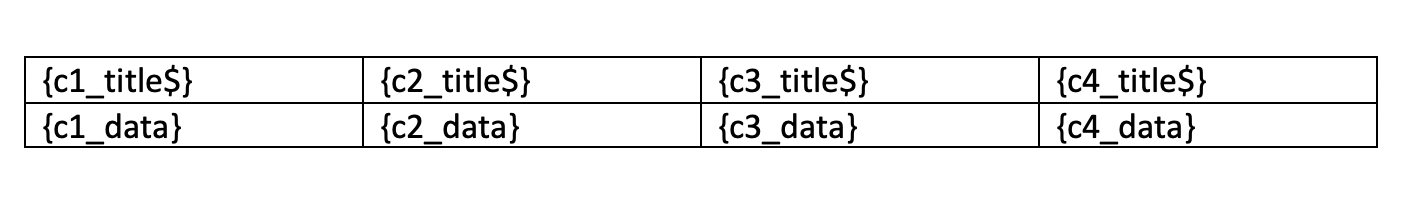
will result in:
This tag can also be combined with a horizontal table loop to set the width for the repeated table columns.
We can use key_group to merge two or more cells, if the values in those cells are same. As for example
{
    "data": [
        {
            "cust_city": "St. Louis",
            "cust_first_name": "Albertos",
            "cust_last_name": "Lambert",
            "orders": [
                {
                    "order_name": "Order 1",
                    "order_total": 950,
                    "product": [
                        {
                            "product_name": "Jacket",
                            "product_name_group": true,
                            "quantity": 3,
                            "unit_price": 50
                        },
                        {
                            "product_name": "Jacket",
                            "product_name_group": true,
                            "quantity": 2,
                            "unit_price": 80
                        },
                        {
                            "product_name": "Jacket",
                            "product_name_group": true,
                            "quantity": 2,
                            "unit_price": 150
                        },
                        {
                            "product_name": "Blouse",
                            "quantity": 3,
                            "unit_price": 60
                        },
                        {
                            "product_name": "Skirt",
                            "product_name_group": true,
                            "quantity": 2,
                            "unit_price": 80
                        },
                        {
                            "product_name": "Skirt",
                            "quantity": 2,
                            "product_name_group": true,
                            "unit_price": 80
                        },
                        {
                            "product_name": "Skirt",
                            "product_name_group": true,
                            "quantity": 2,
                            "unit_price": 80
                        }
                    ]
                }
            ]
        }
    ],
    "filename": "file1"
}
with the template:
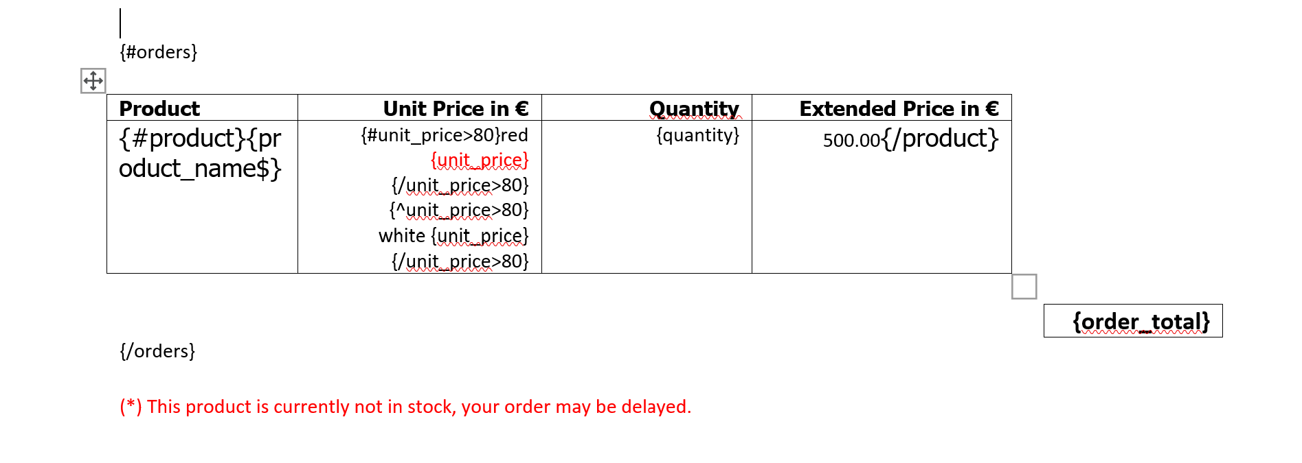
will result in:
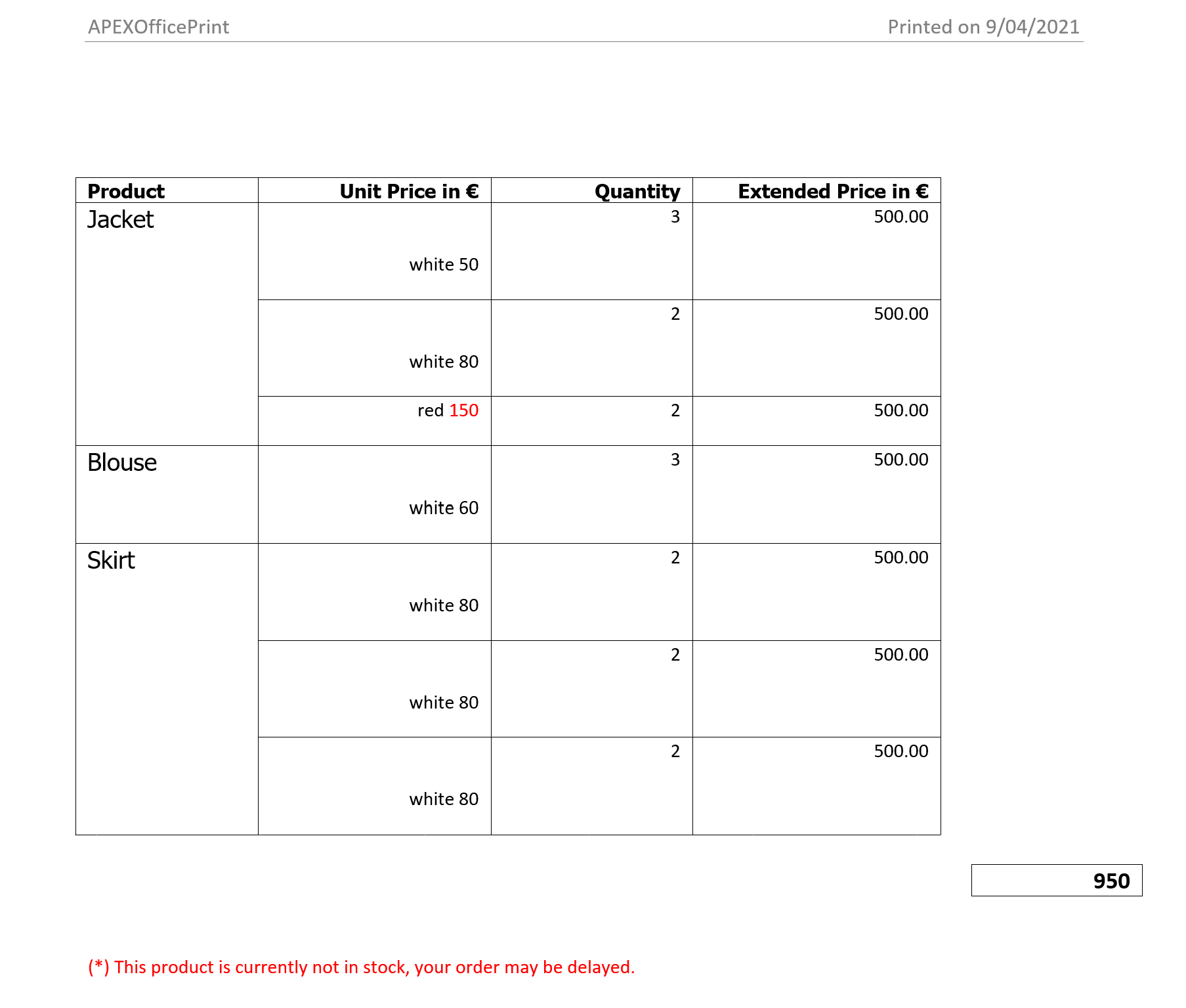
Watermark
Native text watermarks can be added by using the {watermark data} tag in the header of the document, where the data field determines the watermark text. Using section breaks to produce different headers allows the specification of watermarks on a per-page basis. An angular expression can be used instead of a data reference, e.g. {watermark "my watermark"} will produce a watermark with text my watermark, but this does not allow for the specification of options. Options can be specified by appending _optionName to the data field containing the watermark text. The supported options are:
| Option | Description | Allowed | Default |
|---|---|---|---|
| color | watermark text color | CSS notation | "silver" |
| font | watermark text font | font name | Calibri |
| height | height to scale watermark text to | size in px, pt, in, cm or em |
automatically determined by Cloud Office Print |
| opacity | opacity of the watermark text | decimal number between 0 and 1 | 1 |
| rotation | rotation of the watermark text | an integer, interpreted in degrees | calculated to lie along the bottom-left to top-right diagonal |
| width | width to scale watermark text to | size in px, pt, in, cm or em |
automatically determined by Cloud Office Print |
The rotation angle is oriented counterclockwise from the horizontal axis:
For example, using the tag {watermark mark1} in the header of your document, and supplying "mark1": "my watermark" in the data, the output looks like

With additional options
{
    "mark1": "my watermark",
    "mark1_color": "green",
    "mark1_opacity": 0.2,
    "mark1_rotation": -80,
    "mark1_font": "Comic Sans MS",
    "mark1_width": "17cm",
    "mark1_height": "3cm"
}
the result is:

Note: image watermarks are produced by using an image tag in the header area.
{style } Tag
This {style } tag allows user to style their text in Word. It currently supports 7 features, users can choose from following options.
| Features | Objects |
|---|---|
| Font Family | _font_family |
| Font Size | _font_size |
| Font Color | _font_color |
| Bold | _bold |
| Italic | _italic |
| Underline | _underline |
| Strikethrough | _strikethrough |
| Highlight | _highlight |
{style } Tag Example
Given the data of JSON file:
[
    {
        "name": "file1",
        "data": {
            "cust_first_name": "DemoCustomerName",
            "cust_first_name_font_family": "NanumMyeongjo",
            "cust_first_name_font_size": "25pt",
            "cust_first_name_font_color": "#ff00ff",
            "cust_first_name_bold": "true",
            "cust_first_name_italic": true,
            "cust_first_name_underline": "false",
            "cust_first_name_strikethrough": 0,
            "cust_first_name_highlight": "darkMagenta"
        }
    }
]
And following template:
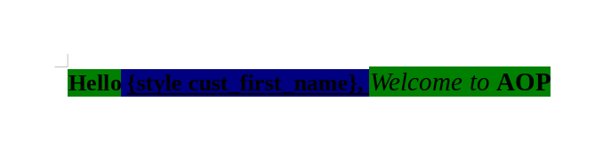
will result in :

The options supported by this features are:
- Font Family: Valid font names like: AnjaliOldLipi, Z003, Liberation Sans
-
Font Size: Numbers or Points like 20pt , 100
Note: If the number is used like (50,100,200) then the actual text size in output reduces by 25% whereas using “pt” results in the same size as given input.
-
Font Color: Hex Color Codes like #ff00ff #002060
- Bold : true,false,”true”,”false”,0,1
- Italic : true,false,”true”,”false”,0,1
- Underline : true,false,”true”,”false”,0,1
- Strikethrough : true,false,”true”,”false”,0,1
- Highlight : Name of colors which are available for highlighting in Word. Currently 15 colors are supported : yellow, green, cyan, magenta, blue, red, darkBlue, darkCyan, darkGreen, darkMagenta, darkRed, darkYellow, darkGray, lightGray, black
Users can omit including above tags for styling which results in the same styling as defined in the template for these features.
Markdown Tag
Markdown styled text can be converted to docx file format. The syntax for this tag is {_key_}. The "key" tag holds the Markdown content in the JSON file. To get a better idea about the basics of Markdown styling syntax, this [documentation][1] will be helpful. For extended Markdown styling syntax this [documentation][2] will be helpful.
Sample template and JSON file for usage of Markdown tag is as follows:

{
    "markdownContent": "..... markdown styled text comes here ....."
}
- https://www.markdownguide.org/basic-syntax/
- https://www.markdownguide.org/extended-syntax/
From the basic syntax documentation, we are supporting:
- Headings and Alternative Headings Syntax
- Paragraphs and Line Breaks
- Bold and Italic emphasized text
- Ordered Lists and Unordered Lists
- Code Blocks
- Images and Images with a Link
- Horizantal Rules
- Links
From the extended syntax documentation, we are supporting:
- Tables
- Fenced Code Blocks
- Strikethrough is supported but as a HTML tag. (i.e. with
<strike>...</strike>or with<s></s>)
Sample Application
Inside the docx template file, using the {_markdownContent_} tag. If below Markdown data (should be escaped from the special characters) is provided inside a JSON file to Cloud Office Print:
## Heading level 2

# Heading level 1

I just love **bold text**.

Italicized text is the _cat's meow_.

1. First item
2. Second item
3. Third item
4. Fourth item

---

-   First item
-   Second item
-   Third item
-   Fourth item

| Syntax    | Description |
| --------- | ----------- |
| Header    | Title       |
| Paragraph | Text        |

<strike>The world is flat.</strike> We now know that the world is round.
the output will look like this:
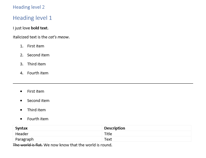
{?form } Tag
This tag allows the creation of PDF forms. The tag starts with ?form string, followed by the key which contains the data. There are three possible form elements. Namely: textboxes, radio buttons, and check boxes. All three form elements have common fields that needs to be provided inside the JSON in order to create these form elements.
- type (required): Indicates which type of form element to be created. Options are text, radio, and checkbox.
- name (required): Unique ID of a form element.
- height (optional): User defined height of a form element. If not specified automatically assigned.
- width (optional): User defined width of a form element. If not specified automatically assigned.
- value (optional): The default value a certain form element will have.
- text (optional): Used as label for some form elements.
- selected (optional): Boolean value (true/false) that checks or unchecks radio button elements.
Only form elements fields indicated with required, height and width are common for every element. The remaining elements are discussed in each form elements section below.
Textbox
When textbox type is given a textbox form element is created. Extra options for textbox type are as follows:
- type (required)
- name (required)
- value (optional)
- height (optional)
- width (optional)
Given the sample json below:
...
"name": {
    "type": "text",
    "value": "",
    "name": "name"
},
"surname": {
    "type": "text",
    "value": "Apex R&D",
    "name": "surname",
    "height": 20,
    "width": 100
},
...
and the template as follows:

the result will look like below picture:

Radio Button
radio type creates radio buttons form elements. Extra options for radio type are as follows:
- type (required)
- name (required)
- heigth (optional)
- width (optional)
- value (optional)
- text (optional)
- selected (optional)
There are two ways of creating radion buttons. By looping or by referencing each radio button specifically.
Looping
This creates radio forms that are interconnecte. A list of items are expected with options for radio type. Given the json below:
...
"radiolist": [
    {
        "type": "radio",
        "name": "Radiolist",
        "value": "List A",
        "text": "List option A",
        "selected": true
    },
    {
        "type": "radio",
        "name": "Radiolist",
        "value": "List B",
        "text": "List option B",
        "selected": false
    }
]
...
and the template as following picture:
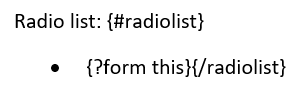
Result will look like this:
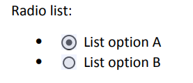
Referencing
This way a single radio form element is created. If multiple radio elements are defined, they are not interconnected and will behave as seperate form elements.
Given the json below:
"radio": {
    "a": {
        "type": "radio",
        "name": "Radio",
        "value": "A",
        "height": 20,
        "width": 200,
        "text": "Option A"
    },
    "b": {
        "type": "radio",
        "name": "Radio",
        "value": "B",
        "height": 20,
        "width": 200,
        "text": "Option B"
    }
}
and the template as following picture:
The result will look like this:
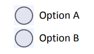
Checkbox
checkbox type will create a checkbox form. Extra options for checkbox type are as follows::
- type (required)
- name (required)
- heigth (optional)
- width (optional)
- value (optional)
- text (optional)
The value field here can only be used with a boolean value to check or uncheck the checkbox by defaul.
Given the json below:
"checkbox": {
    "type": "checkbox",
    "name": "Checkbox",
    "value": true,
    "height": 20,
    "width": 200,
    "text": "Check?"
}
and the template as following picture:
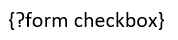
The result will look like this:

PowerPoint (pptx) Template
For pptx templates all the tags presented in the Word section are supported. Attention should be paid when using "#", "%", "\$" and "\^" tags, namely they should be on their own text field. For charts and images, the position of the text field will determine where the top left of the chart or image will start. Repeating a template slide is done by specifying which array should be looped over with a "!" tag after the curly bracket, for example {!products} to loop over the product array. If none is declared the root object is taken as array. Multiple "!" tags are not allowed in one slide.
Given the JSON file with following content:
"data": [
    {
        "slide_title": "Slides Per Product",
        "company_name": "Company A",
        "product": [
            {
                "product_name": "Business Shirt",
                "quantity": 3,
                "unit_price": 50
            },
            {
                "product_name": "Trousers",
                "quantity": 3,
                "unit_price": 80
            },
            {
                "product_name": "Jacket",
                "quantity": 3,
                "unit_price": 15
            },
            {
                "product_name": "Blouse",
                "quantity": 3,
                "unit_price": 60
            }
        ]
    }
]
and the pptx template as follows:
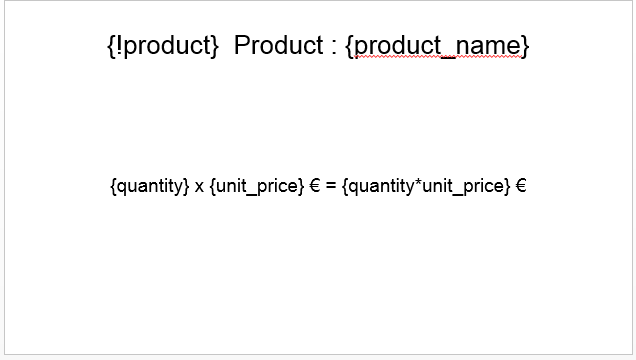
will have following slide as first slide :

Since there is only one item in the root JSON object this slide is repeated only once.The second slide of the template contains the {!product} tag. Since there are 4 objects in the product array this slide will be repeated four times. The result is as follows:
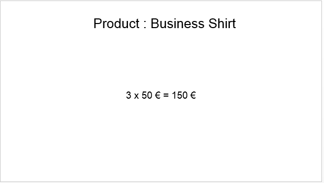
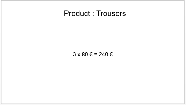
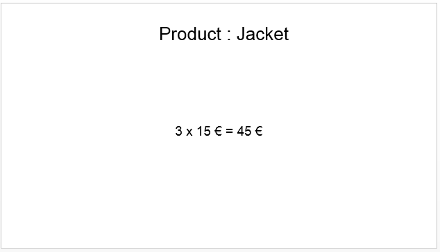

{+link}
With this tag you can link up two slides. Given the data:
"products": [
    {
        "PRODUCT_NAME": "Skirt",
        "PRODUCT_DESCRIPTION": "Wrinkle free skirt",
        "LIST_PRICE": 80,
        "PRODUCT_IMAGE": "......base64....."
    },
    {
        "PRODUCT_NAME": "Ladies Shoes",
        "PRODUCT_DESCRIPTION": "Low heel and cushioned interior for comfort and style in simple yet elegant shoes",
        "LIST_PRICE": 120,
        "PRODUCT_IMAGE": "......base64....."
    },
    {
        "PRODUCT_NAME": "Belt",
        "PRODUCT_DESCRIPTION": "Leather belt",
        "LIST_PRICE": 30,
        "PRODUCT_IMAGE": "......base64....."
    },
    {
        "PRODUCT_NAME": "Bag",
        "PRODUCT_DESCRIPTION": "Unisex bag suitable for carrying laptops with room for many additional items",
        "LIST_PRICE": 125,
        "PRODUCT_IMAGE": "......base64....."
    },
    {
        "PRODUCT_NAME": "Mens Shoes",
        "PRODUCT_DESCRIPTION": "Leather upper and lower lace up shoes",
        "LIST_PRICE": 110,
        "PRODUCT_IMAGE": "......base64....."
    },
    {
        "PRODUCT_NAME": "Wallet",
        "PRODUCT_DESCRIPTION": "Travel wallet suitable for men and women. Several compartments for credit cards, passports and cash",
        "LIST_PRICE": 50,
        "PRODUCT_IMAGE": "......base64....."
    },
    {
        "PRODUCT_NAME": "Business Shirt",
        "PRODUCT_DESCRIPTION": "Wrinkle-free cotton business shirt",
        "LIST_PRICE": 50,
        "PRODUCT_IMAGE": "......base64....."
    },
    {
        "PRODUCT_NAME": "Trousers",
        "PRODUCT_DESCRIPTION": "Black trousers suitable for every business man",
        "LIST_PRICE": 80,
        "PRODUCT_IMAGE": "......base64....."
    },
    {
        "PRODUCT_NAME": "Jacket",
        "PRODUCT_DESCRIPTION": "Fully lined jacket which is both professional and extremely comfortable to wear",
        "LIST_PRICE": 150,
        "PRODUCT_IMAGE": "......base64....."
    },
    {
        "PRODUCT_NAME": "Blouse",
        "PRODUCT_DESCRIPTION": "Silk blouse ideal for all business women",
        "LIST_PRICE": 60,
        "PRODUCT_IMAGE": "......base64....."
    }
]
And the template with repetition:
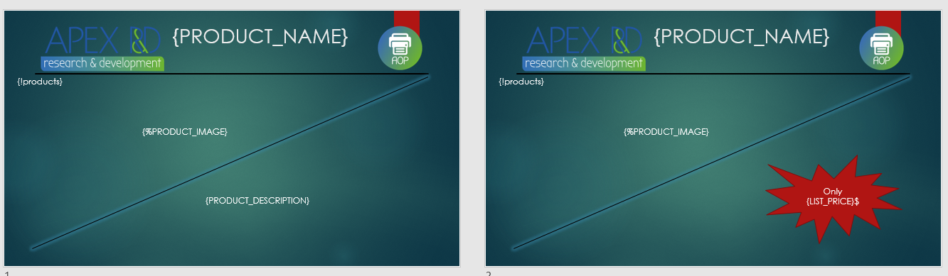
will result in:
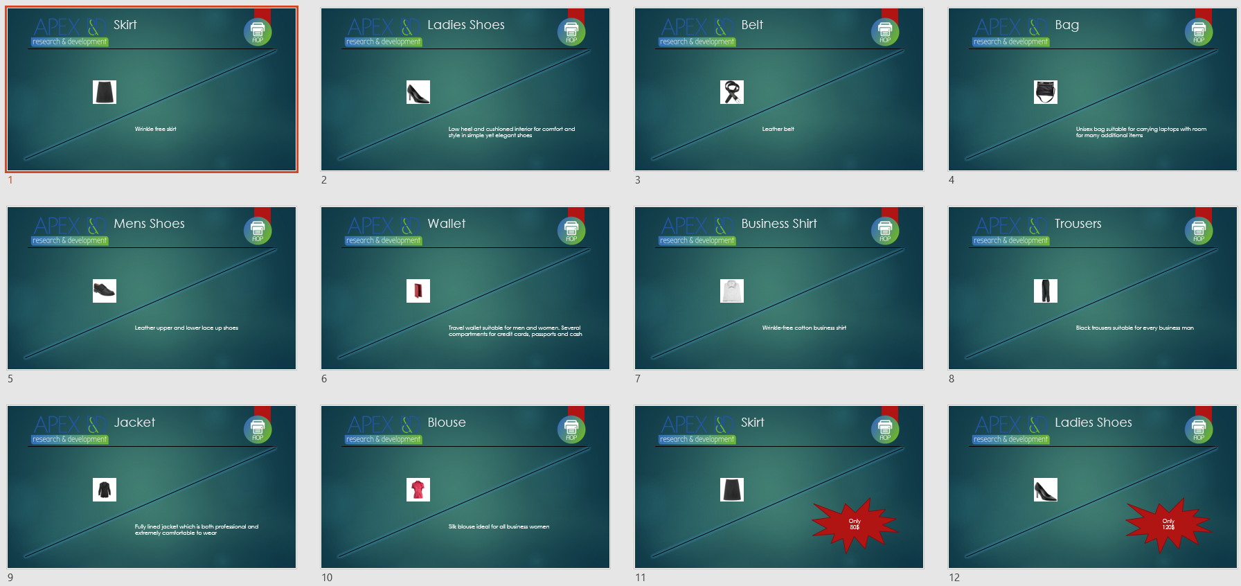
Here the first slide is repeated for all the products then the second slides is repeated for all the products. However we want both slide 1 and slide 2 to repeat one after the other. To do this just link them with a unique key {+link}
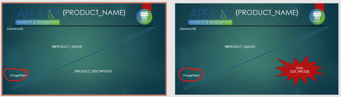
Would result in:
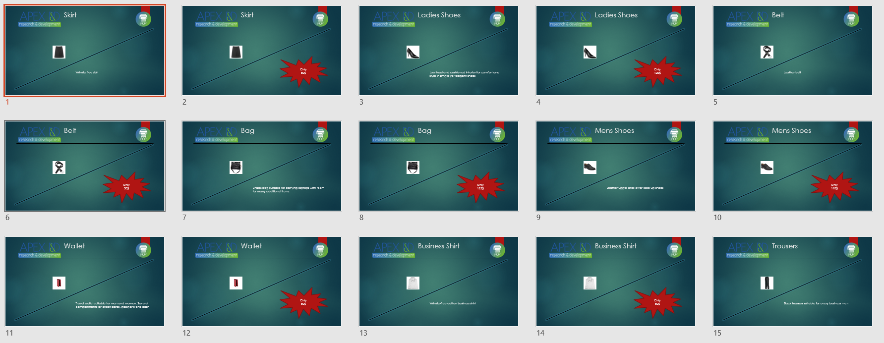
Document Insert
Inside Word and PowerPoint documents, the tag {?insert fileToInsert} is available. Inside Word and PowerPoint documents you can use this tag to insert Word, Excel, PowerPoint and PDF documents.
IMPORTANT NOTE: PDF and PowerPoint embedding will not work when the output file is opened in MACOS. This is rather the limitation of Microsoft Office/ Libreoffice itself.
Given the following JSON:
{
    "fileToInsert": "base64 encoded file" // URL, PATH TO FILE, BASE64, FTP
}
with the template containing {?insert fileToInsert} would replace the tag with the icon for that document type. When double clicked the inserted document would open in a new window.
{style } Tag
This {style } tag allows user to style their text in powerpoint (.pptx). It currently supports 8 (eight) features, users can choose from following options depending on how they text to look:
| Features | Objects |
|---|---|
| Font Family | _font_family |
| Font Size | _font_size |
| Font Color | _font_color |
| Bold | _bold |
| Italic | _italic |
| Underline | _underline |
| Strikethrough | _strikethrough |
| Highlight | _highlight |
{style } Tag Example
Given the data of JSON file:
[
    {
        "name": "file1",
        "data": {
            "cust_first_name": "DemoCustomerName",
            "cust_first_name_font_family": "Z003",
            "cust_first_name_font_size": "15pt",
            "cust_first_name_font_color": "#000aaa",
            "cust_first_name_bold": "false",
            "cust_first_name_italic": false,
            "cust_first_name_underline": "true",
            "cust_first_name_strikethrough": 0,
            "cust_first_name_highlight": ""
        }
    }
]
And template.pptx with some content:

will result in :

The options supported by this features are:
- Font Family: Valid font names like: AnjaliOldLipi, Z003, Liberation Sans
-
Font Size: Numbers or Points like 20pt , 100
Note: If the number is used like (50,100,200) then the actual text size in output is reduced by 25% whereas using “pt” results in the same size as given input.
-
Font Color: Hex Color Codes like #ff00ff #002060
- Bold : true,false,”true”,”false”,0,1
- Italic : true,false,”true”,”false”,0,1
- Underline : true,false,”true”,”false”,0,1
- Strikethrough : true,false,”true”,”false”,0,1
-
Highlight : Name of colors supported by microsoft powerpoint.
Note: There is an issue in output file while rendering Text Highlighting in LibreOffice Impress. However, this isnot a bug of Cloud Office Print.
Users can omit including above tags for styling which results in the same styling as defined in the template for these features.
{=table_row_loop} … {/table_row_loop} Tag Example
This tag will merge cells over N rows. Given the data of JSON file:
"data": [
    {
        "continents": [
            {
                "continent": "Asia",
                "countries": [
                    {
                        "country": "Nepal",
                        "population": "28.09 million (2018)"
                    },
                    {
                        "country": "India",
                        "population": "21.353 billion (2018)"
                    },
                    {
                        "country": "China",
                        "population": "1.393 billion (2018)"
                    }
                ]
            },
            {
                "continent": "Europe",
                "countries": [
                    {
                        "country": "Belgium",
                        "population": "11.46 million (2019)"
                    },
                    {
                        "country": "France",
                        "population": "66.99 million (2019)"
                    }
                ]
            }
        ]
    }
]
And template.pptx with some content:

will result in :
Excel (xlsx) Template
In the xslx templates, some of the tags of the Word and PowerPoint templates can be used. An overview of them can be seen in the overview table at the start of this section. The JSON format should contain the same meta information elements (e.g. template_type, filename, …) and the data information is stored under files/data.
Regular tags can be used with corresponding keyword in the JSON file between brackets, like in the docx and pptx templates. The xlsx templates can loop over elements in a list by using the same technique as in the docx template: {#loop_element} to enter the loop and {/loop_element} to close it. The cells that are in the rectangle bounded by these two tags will be looped over and filled in using the data available in the JSON file. Nested loops are possible (however keep in mind to remain within the rectangle formed by the "parent" loop – see note after example below). Style will be copied from the template to the generated file accordingly. As with the docx templates, simple angular expressions can be used to perform mathematical operations.
Xlsx example:
Given the JSON file with following content:
"data": [
    {
        "cust_first_name": "Albert",
        "cust_last_name": "Lambert",
        "cust_city": "St. Louis",
        "orders": [
            {
                "order_total": 310,
                "order_name": "Casual Shop's Order",
                "product": [
                    {
                        "product_name": "Shirt",
                        "quantity": 3,
                        "unit_price": 50
                    },
                    {
                        "product_name": "Trousers",
                        "quantity": 2,
                        "unit_price": 80
                    }
                ]
            },
            {
                "order_total": 200,
                "order_name": "Sport Shop's order",
                "product": [
                    {
                        "product_name": "Sport's shoes",
                        "quantity": 2,
                        "unit_price": 100
                    }
                ]
            }
        ]
    }
]
and the xlsx template as follows:
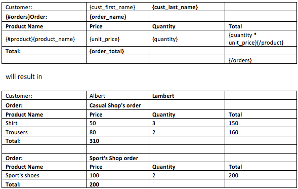
Note: in the example above the {/orders} closing tag must be in the last column. Otherwise the child loops inside {#orders}…{/orders}, in this case {#product}…{/product}, would not be able to generate inside the rectangle formed between the tags of its parent loop ({#orders}…{/orders}).
{data_string_with_cell_markup$}
With a $ sign and by appending _option at the end of a tag, it is possible to specify different styles in a cell. This allows for example to change the background of the cell dynamically. The different excel styles can be specified by appending any of the following to the tag:
- cell_locked: [y/n]
- cell_hidden: [y/n]
- cell_background: hex color e.g: #ff0000
- font_name: name of the font e.g: Arial
- font_size: e.g 14,
- font_color: hex color e.g: #00ff00
- font_italic: [y/n]
- font_bold: [y/n]
- font_strike: [y/n]
- font_underline: [y/n]
- font_superscript:[y/n]
- font_subscript:[y/n]
- border_top: [dashed / dashDot / hair / dashDotDot / dotted / mediumDashDot / mediumDashed / mediumDashDotDot / slantDashDot / medium / double / thick ]
- border_top_color: hex color e.g: #000000
- border_bottom: [dashed / dashDot / hair / dashDotDot / dotted / mediumDashDot / mediumDashed / mediumDashDotDot / slantDashDot / medium / double / thick ]
- border_bottom_color: hex color e.g: #000000
- border_left: [dashed / dashDot / hair / dashDotDot / dotted / mediumDashDot / mediumDashed / mediumDashDotDot / slantDashDot / medium / double / thick ]
- border_left_color: hex color e.g: #000000
- border_right: [dashed / dashDot / hair / dashDotDot / dotted / mediumDashDot / mediumDashed / mediumDashDotDot / slantDashDot / medium / double / thick ]
- border_right_color: hex color e.g: #000000
- border_diagonal: [dashed / dashDot / hair / dashDotDot / dotted / mediumDashDot / mediumDashed / mediumDashDotDot / slantDashDot / medium / double / thick ]
- border_diagonal_direction: [up-wards|down-wards| both]
- border_diagonal_color: hex color e.g: #000000
- text_h_alignment: [top|bottom|center|justify]
- text_v_alignment: [top|bottom|center|justify]
- text_rotation: rotation of text value from 0-90 degrees
For example, by using font_color in the data
{
    "text": "Hello!",
    "text_font_color": "DeepSkyBlue"
}
the tag {text$} outputs Hello! in DeepSkyBlue.
It is possible to give the number format with the styles:
- format_mask: "999G999G999G999G990D00PR"
- currency: "$"
The same format_mask option can also be specified as a date format mask, e.g. "MM/DD/YYYY", for data which matches an ISO 8601 date.
Together with the format mask, we've added the possibility to adjust the height and width of the cells. We expect the following data:
- width: "auto" or number (in pixels) (optional)
- height: "auto" or number (in pixels) (optional)
- wrap_text: true or false
- max_characters : Number //max character per line
Please note that if the tag is {example$} is used, then the data provided should be inside example_cell_background, example_font_italic etc. If you are using the format mask, then the Excel settings will define which thousand separator and decimal separator to use.
Since version 19.2.1 you can also provide a custom excel format, i.e the format mask provided will be placed into the excel cell without modifications. The format mask should start with "excel:" followed by the format mask. e.g.:
excel:#,##0.00;[Red]-#,##0.00
{!sheetgeneration}
You can generate sheets automatically by using {!tag} in any cell. This can for example be used to generate a sheet report per customer. The sheet name can also be dynamically changed and should be provided by the key "sheet_name". An example:
{
    "customers": [
        {
            "sheet_name": "John Dulles", // sheet name!
            "sheet_dynamic_print_area": true, // whether or not the print area should be changed automatically.
            "cust_first_name": "John",
            "cust_last_name": "Dulles",
            "cust_city": "Sterling",
            "orders": [
                {
                    "order_total": 2380,
                    "order_name": "Order 1",
                    "product": [
                        {
                            "product_name": "Business Shirt",
                            "quantity": 3,
                            "unit_price": 50
                        },
                        {
                            "product_name": "Trousers",
                            "quantity": 3,
                            "unit_price": 80
                        },
                        {
                            "product_name": "Jacket",
                            "quantity": 3,
                            "unit_price": 150
                        }
                    ]
                }
            ]
        },
        {
            "sheet_name": "William Hartsfield",
            "cust_first_name": "William",
            "cust_last_name": "Hartsfield",
            "cust_city": "Atlanta",
            "orders": [
                {
                    "order_total": 1640,
                    "order_name": "Order 1",
                    "product": [
                        {
                            "product_name": "Blouse",
                            "quantity": 4,
                            "unit_price": 60
                        },
                        {
                            "product_name": "Skirt",
                            "quantity": 4,
                            "unit_price": 80
                        }
                    ]
                },
                {
                    "order_total": 730,
                    "order_name": "Order 2",
                    "product": [
                        {
                            "product_name": "Blouse",
                            "quantity": 4,
                            "unit_price": 60
                        }
                    ]
                }
            ]
        }
    ]
}
And the template:
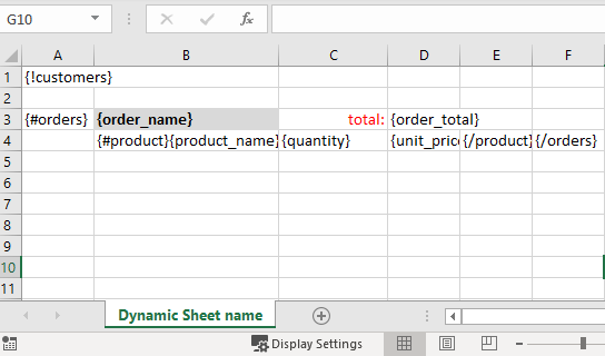
will result in:
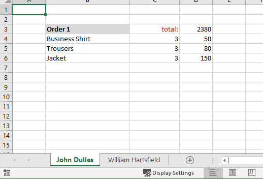
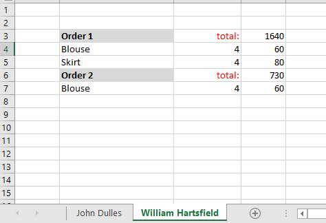
It is possible to let Cloud Office Print auto expand the print area dynamically. For this the key "sheet_dynamic_print_area" should be set to true or 1. This is false by default.
{*hyperlink}
This is similar to the hyperlink tag mentioned in the Word section, except that in Excel, it is possible to hyperlink to a specific sheet and cell inside the document itself. The URL then should be of structure: "SheetName!Cell". An example:
{
    "examplehyperlink": "HyperlinkTarget!B2",
    "examplehyperlink_text": "Go to HyperlinkTarget"
}
with template
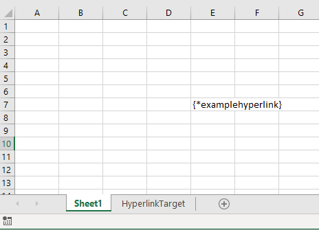
will result in:
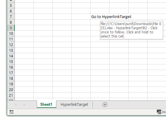
{span#}
The span tag is defined by the "#" character before the closing curly bracket. This tag allows you to specify the columns and rows to span by a cell. Columns to be spanned is specified by key_col_span attribute and rows to be spanned is specified by _row_span.
{
    "span": "This cell will span 2 rows and 3 columns",
    "span_row_span": "2",
    "span_col_span": "3"
}
{##static_condition}
The static condition tag is defined by the two ## characters after the opening curly bracket. This tag allows you to create a conditional block, which when false won't push the rows below the condition above. This is similar to {#data_loop} tag but the rows won't be pushed up, when the condition fails.
{>formula}
The formula tag is defined by the > character after the opening curly bracket. The formula tag will let you insert an excel formula inside the file. Please note that no verification is performed on this formula.
Given the JSON:
{
    "formula": "5*4",
    "formula_loop": [
        {
            "value1": 50,
            "value2": 20,
            "generated_formula": "A9+B9"
        },
        {
            "value1": 50,
            "value2": 10,
            "generated_formula": "A10+B10"
        },
        {
            "value1": 40,
            "value2": 30,
            "generated_formula": "A11+B11"
        },
        {
            "value1": 70,
            "value2": 30,
            "generated_formula": "A12+B12"
        }
    ]
}
and the template:
 will result in:
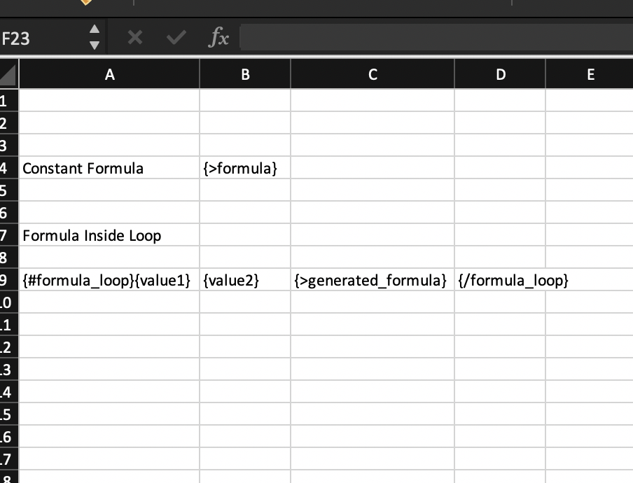
Page Breaks
Appyling page breaks to your excel file is possible by means of {?pageBreakTag}. pageBreakTag refers to a variable name that is placed in the json file. Value of pageBreakTag should be set to true;
Given the template below,
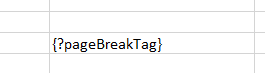
with the json file,
{
    "pageBreakTag": "true" // or true or 1
}
Output would look like this in the excel page break preview:
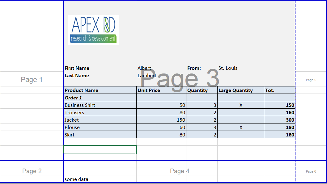
{_htmlContent}
HTML tags, just like for Word documents, can be converted to Excel documents. The tag that has to be used is {_key}, the underscore is followed by the key which has the HTML content in the JSON file. The usage of tags and styling options will be discussed in more detail in the following subsections. The tags and styling options that are currently supported are the following:
<br />
<!-- : in order to introduce breaks (newline) -->
<p>...</p>
<!-- : represents a paragraph -->
<div>...</div>
<!-- : a block level container -->
<strong>...</strong>
<!-- : bold text -->
<b>...</b>
<!-- : bold text -->
<s>...</s>
<!-- : strike through -->
<u>...</u>
<!-- : underline -->
<em>...</em>
<!-- : italics -->
<var>...</var>
<!-- : italics -->
<i>...</i>
<!-- : italics -->
<ins>...</ins>
<!-- : underline -->
<del>...</del>
<!-- : strike through -->
<small>...</small>
<!-- : represents side-comments and small print -->
<h1>...</h1>
<!-- : heading 1 -->
<h2>...</h2>
<!-- : heading 2 -->
<h3>...</h3>
<!-- : heading 3 -->
<h4>...</h4>
<!-- : heading 4 -->
<h5>...</h5>
<!-- : heading 5 -->
<h6>...</h6>
<!-- : heading 6 -->
<sub>...</sub>
<!-- : subscript -->
<sup>...</sup>
<!-- : superscript -->
<ol>
    ...
</ol>
<!-- : ordered list -->
<ul>
    ...
</ul>
<!-- : unordered list -->
<li>...</li>
<!-- : list item -->
<table>
    ...
</table>
<!-- : table -->
<tr>
    ...
</tr>
<!-- : table row -->
<th>...</th>
<!-- : table headers -->
<td>...</td>
<!-- : table data -->
<img src="..." />
<!-- : image (alt="..." width="..." height="..." ... are optional) -->
<a href="...">...</a>
<!-- : hyperlink <span>...</span> : an inline container -->
Following properties are inline CSS styling properties. Their general usage should be in the format of style="inlineCSSpropert : stylingParameter;". The syntax is important. After the inlineCSSproperty there must be a double dot and after the styling parameter there must be a semi colon. For example:
<p style="background-color: yellow;">
color               : Specifies the color of text. (e.g.: red, #00ff00, rgb(0,0,255))
font-size           : Sets the size of a font. (e.g.: 15px, large)
font-style          : The font style for a text (e.g.: italic, oblique)
font-weight         : The font style for a text (e.g.: bold)
text-decoration     : The decoration added to text (e.g.: underline, line-through)
background-color    : The background color of an element (e.g.: red, #00ff00, rgb(0,0,255))
text-indent         : The indentation of the first line in a text-block (e.g.: 5px)
vertical-align      : The vertical alignment of an element (e.g.: baseline, text-top, text-bottom)
text-align          : The horizontal alignment of text in an element (e.g.: center, left, right)
border-style        : The style of an element's four borders. This property can have from one to four values. (e.g.: dotted solid double dashed)
border-color        : The color of an element's four borders. This property can have from one to four values. (e.g.: red green blue pink)
border-right        : Defines a border for right part of the element. The border-right is a shorthand property for border-right-width, border-right-style (required), and border-right-color. (e.g.: 5px solid red)
                      However border-right-width property is not supported due to limitations of Excel. One can still define width but it will be omitted. If two values will be defined it must only contain style and color information.
border-left         : Defines a border for left part of the element. Same rules apply as border-right.
border-top          : Defines a border for top part of the element. Same rules apply as border-right.
border-bottom       : Defines a border for bottom part of the element. Same rules apply as border-right.
font-family         : Specifies the font for an element. (e.g.: Times New Roman (note that it is provided without quotation mark), Arial)
General Overview
While preparing a HTML code for Cloud Office Print, we need to consider a few requirements regarding the HTML syntax and the limitations imposed by Excel. We will discuss those requirements lower. Now let's take a look at a sample usage of this new tag.
In below example we provided an example that contains almost all of the tags that are supported.
<p>
    This is text coming from the database / session in HTML format. <br />It
    supports:
</p>
<ol>
    <li>Lists</li>
    <li><strong>Bold</strong></li>
    <li><em>Italic</em></li>
    <li><u>Underline</u></li>
    <li><s>Strikethrough</s></li>
    <li>Sub<sub>script</sub></li>
    <li><sup>Super</sup>script</li>
    <li><small>Small</small></li>
    <li style="color:#FF0000;">Text Color</li>
    <li style="background-color:#FFFF00;">Background Text Color</li>
</ol>

<h1>Heading 1</h1>
<h2>Heading 2</h2>
<h3>Heading 3</h3>
<h4>Heading 4</h4>
<h5>Heading 5</h5>
<h6>Heading 6</h6>

<table style="border-style: solid; border-color: red;">
    <tr>
        <th>Headers</th>
        <th>Borders</th>
    </tr>
    <tr>
        <td>Border Color</td>
        <td>Font Color</td>
    </tr>
</table>
This will result in the following Excel file:
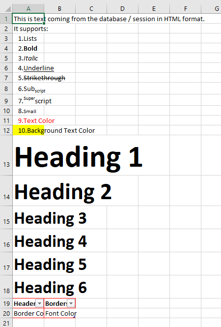
Block and Inline Elements
When using HTML inside Excel, we are limited by the cell structure of Excel. Because of this reason using proper HTML syntax in terms of Block and Inline elements is crucial for getting correct results. Below, one can find all of the block and inline elements that Cloud Office Print supports.
| Block Elements | Inline Elements |
|---|---|
| \<div> | \<u> |
| \<h1> - \<h6> | \<b> |
| \<li> | \<br> |
| \<ol> | \<em> |
| \<p> | \<i> |
| \<table> | \<img> |
| \<ul> | \<small> |
| \<th> | \<span> |
| \<td> | \<strong> |
| \<a> | \<sub> |
| \<sup> | |
| \<var> | |
| \<s> | |
| \<del> | |
| \<ins> |
The block elements' scope can be considered as a single Excel cell and inline elements are the elements that are inside block elements.
Not all CSS styling elements are supported for Excel templates.
Below table summarizes the supported CSS styling options.
| Block Level Styling | Inline Level Styling |
|---|---|
| background-color | color |
| text-indent | font-size |
| vertical-align | font-style |
| text-align | font-weight |
| border-style | text-decoration |
| border-color | font-family |
| border-right | |
| border-left | |
| border-top | |
| border-bottom |
In this table most important part is block level styling elements. Inline level styling can be used with any sort of HTML tags, but block level styling elements can only be used with block level elements.
\<table> Tag
HTML tables are either placed in Excel tables or placed in the format of table. If the table that wanted to be placed in Excel contains headers, or \<th> elements, it will be rendered as Excel tables otherwise it will be placed in the form of a table.
Below is a table example with \<th>,
<table>
    <tr>
        <th>Table Header 1</th>
        <th>Table Header 2</th>
    </tr>
    <tr>
        <td>Table Data 1</td>
        <td>Table Data 2</td>
    </tr>
</table>
It will look like below picture.
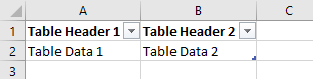
Below is a table example just with \<td>,
<table>
    <tr>
        <td>Table Header 1</td>
        <td>Table Header 2</td>
    </tr>
    <tr>
        <td>Table Data 1</td>
        <td>Table Data 2</td>
    </tr>
</table>
It will look like below picture.
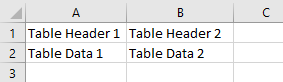
Currently Cloud Office Print doesn't support Block Level Elements inside tables.
\<ol> and \<ul> Tags
Ordered lists, \<ol>, and unordered list, \<ul>, can be nested within each other and within any other element that is currently supported by Cloud Office Print. Below is an example containing nested ordered lists and unordered list.
<ol>
    <li>Ordered Level 1.1</li>
    <li>Ordered Level 1.2</li>
    <li>
        Ordered Level 1.3
        <ol>
            <li>Ordered Level 2.1</li>
            <li>
                Ordered Level 2.2
                <ol>
                    <li>Ordered Level 3.1</li>
                    <li>Ordered Level 3.2</li>
                    <li>Ordered Level 3.3</li>
                </ol>
            </li>
            <li>Ordered Level 2.3</li>
        </ol>
    </li>
    <li>
        Ordered Level 1.4
        <ul>
            <li>Unordered Level 1.1</li>
            <li>
                Unordered Level 1.2
                <table>
                    <tr>
                        <td>Table Header 1</td>
                        <td>Table Header 2</td>
                        <td>Table Header 3</td>
                    </tr>
                    <tr>
                        <td>Table data 1</td>
                        <td>Table <b>data</b> 2</td>
                        <td>Table data 3</td>
                    </tr>
                    <tr>
                        <td>
                            Tab<i
                                >le<small><u>da</u></small
                                >ta</i
                            >
                            4
                        </td>
                        <td>Table data 5</td>
                        <td>Table data 6</td>
                    </tr>
                    <tr>
                        <td>Table data 7</td>
                        <td>Table data 8</td>
                        <td>Table data 9</td>
                    </tr>
                </table>
            </li>
            <li>
                Unordered Level 1.3
                <ul>
                    <li>Unordered <b>Level 2.1</b></li>
                    <li>Unordered <u>Level 2.2</u></li>
                    <li>
                        Unordered Level 2.3
                        <ul>
                            <li>Unordered Level 3.1</li>
                            <li>Unordered Level 3.2</li>
                            <li>Unordered Level 3.3</li>
                        </ul>
                    </li>
                </ul>
            </li>
        </ul>
    </li>
</ol>
The result will look like this,
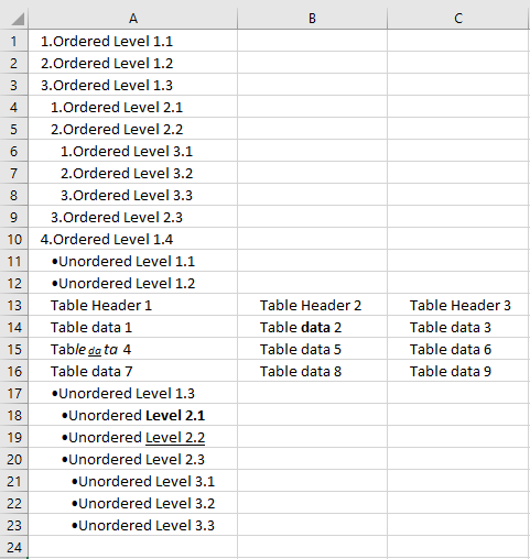
\<a> Tag
HTML hyperlinks, \<a>, are supported by Cloud Office Print. Below is an example of how to use it,
<a href="https://united-codes.com/index.html">United Code website</a>
This will result in the following way,
\<img> Tag
HTML images, \<img>, are supported by Cloud Office Print. Source can be links, base64 encoded images etc. Alt text, width, and height of the images can be optionally given. Below is an example of how to use it,
<img
    src="https://picsum.photos/seed/picsum/200/300"
    alt="Alt Text"
    width="500"
    height="500"
/>
This will result in the following picture,
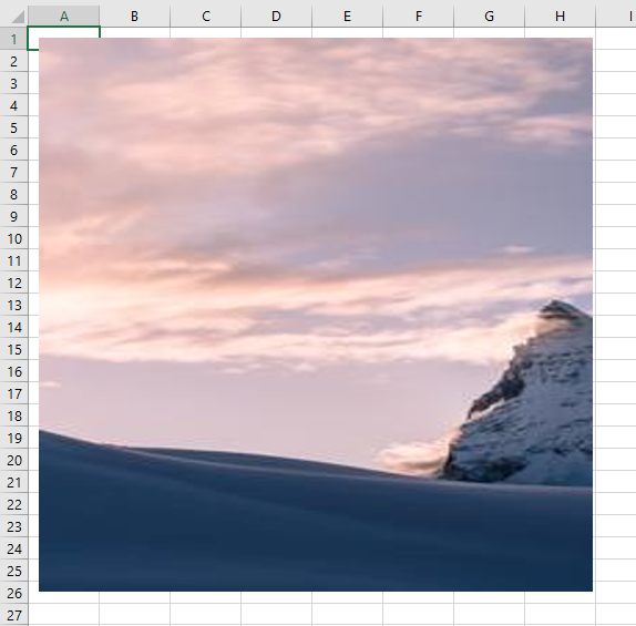
Images can be used as hyperlinks as well. Below is an example of it,
<a href="https://united-codes.com/index.html">
    <img
        src="https://picsum.photos/seed/picsum/200/300"
        alt="Alt Text"
        width="500"
        height="500"
    />
</a>
{tbox text}
This tag will allow you to insert a text box starting in the cell containing the tag in Excel. The following customizations are available:
{
    "key": "Text in the text box",
    "key_font": "Times New Roman", // The font to use, optional, default Calibri
    "key_font_color": "#ff00ff", //The color for the font (css style colors), optional, default black
    "key_font_size": "11", //Font Size, optional default; 60
    "key_transparency": "90%", // Amount of transparency in percent, optional default: 0%.
    "key_width": "500px", // Height of text box, optional default: 11.22in
    "key_height": "200px" //height of text box, optional default: 3.11in
}
Example:
This template:
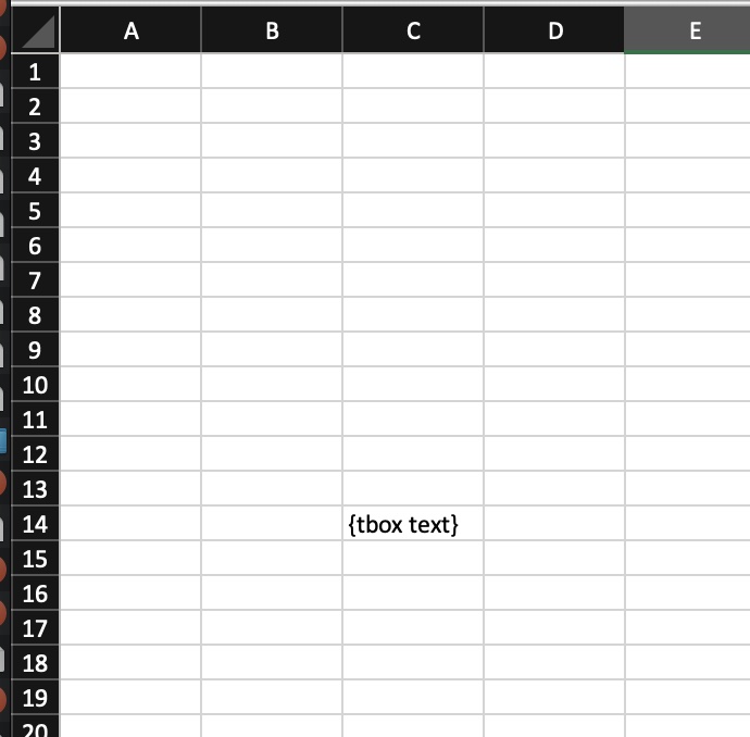
and this data:
{
    "text": "Text Box content"
}
will generate:
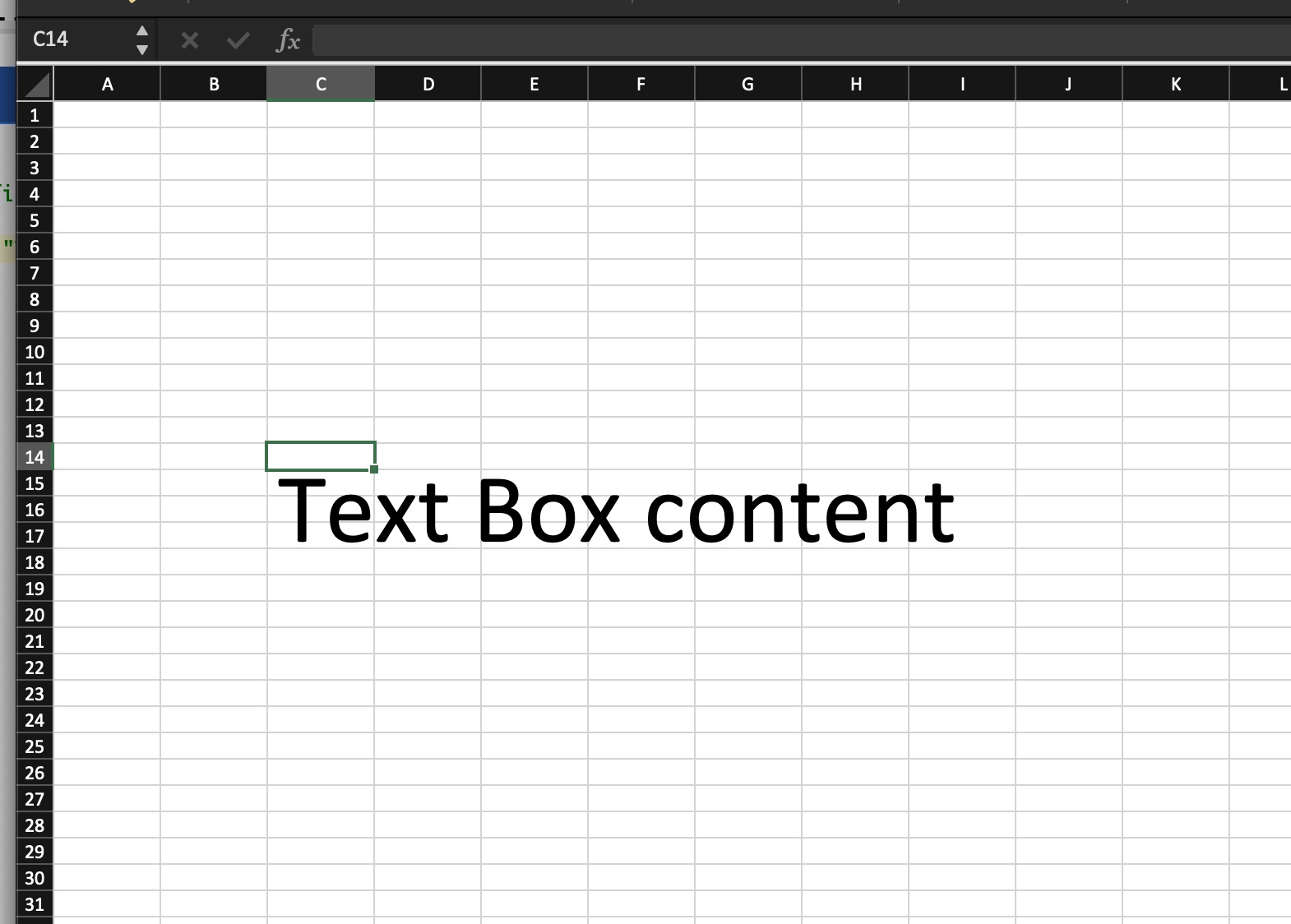
{freeze freezeLocation}
With the freeze tag we can utilize freeze pane property of the excel. Three options are available. First option, we can directly place the pane where the tag located. For this option we should provide true parameter. Second option, we can provide the location where we want to place the pane such as "C5". It should be in the format of excel column and row. For column number it should be a letter and for row number it should be an integer. Finally, the third option is false which doesn't place a pane.
The template:
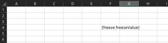
and data provided:
...
"freezeValue": true
...
output will look like this:
If data provided contains the location:
...
"freezeValue": "B2"
...
it will look like this:
QRCode Image Replacing
Cloud Office Print allows you to replace a QRcode image with another image. The QR code can contain the image tags and barcode tags, i.e {%key} or {|key}. This method can be used if you are inserting a floating image, or need to have certain border styles on the image. The tag replacing will work as look as there are no artistic effects used for the image themselves.
Please note that the scope always starts at the default place, so the {#loop} tags have no effect.
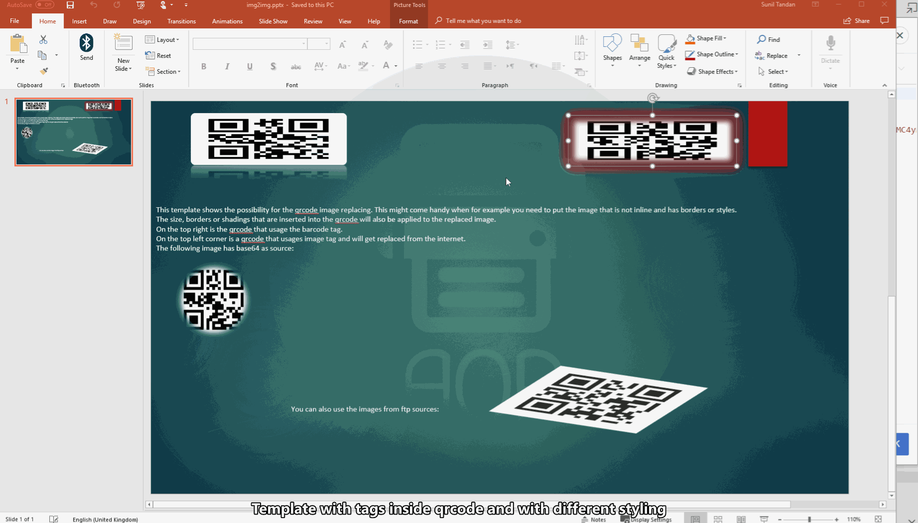
Converter
This feature only works when the output_type is pdf
Cloud Office Print can convert several types of files and/or append/prepend them to the outputted files.
Appending/Prepending Files
All append/prepend files will first be converted to PDF, after which the pages (as a whole) will be prepended/appended to the outputted files. E.g. images will appear on their own page, not "pasted" into the template file.
General Structure
The JSON sent to the Cloud Office Print server will have this structure:
{
    ...
    "template": { ... },
    "output": {
        "output_encoding": "base64",
        "output_type": "pdf" // Converter functionality only works with PDF as output_type
    },
    "files": [
        {
            "data": { ... },
            "filename": "File1"
        },
        {
            "data": { ... },
            "filename": "File2"
        },
        ...
    ],
    "prepend_files": [
        // Array of files to prepend (see File Structure)
        { ... },
        { ... },
        ...
    ],
    "append_files": [
        // Array of files to append (see File Structure)
        { ... },
        { ... },
        ...
    ]
}
File Structure
{
    "filename": "Filename",
    "mime_type": "MIME TYPE",
    // File source can be "plain", "base64", "url" or "file",
    "file_source": "FILE SOURCE",
    // Used by "file_source": "plain" and "base64",
    "file_content": "...",
    // Used by "file_source": "url",
    "file_url": "http://..."
}
Multiple Files
Should the JSON contain multiple files, e.g. like this:
{
    ...
    "files": [
        {
            "data": { ... },
            "filename": "File1"
        },
        {
            "data": { ... },
            "filename": "File2"
        },
        ...
    ],
}
Then, as might be expected, a zip archive will be returned containing File1.pdf and File2.pdf. The append/prepend files will be appended/prepended to each file.
Converting Without Template
Cloud Office Print allows converting files without a template, resulting in the append/prepend files being converted and stitched together.
General Structure
The JSON sent to Cloud Office Print will have this structure:
{
    ...
    "template": {
        // This template_type is template-less
        "template_type": "converter"
    },
    "output": {
        "output_encoding": "base64",
        "output_type": "pdf", // Converter functionality only works with PDF as output_type
        "icon_font": "Font Awesome 5" // Changes the rendering font used to generate icons when converting HTML to PDF. Supported fonts are: "Font Awesome 5".
    },
    // If the files array is empty, it'll default to a file with filename "Converted"
    // Giving (multiple) files will just result in a zip archive with identical files, but with the given names
    "files": [],
    "prepend_files": [
        // Array of prepend files (see File Structure)
        { ... },
        { ... },
        ...
    ],
    "append_files": [
        // Array of prepend files (see File Structure)
        { ... },
        { ... },
        ...
    ]
}
Should "files" be empty or only contain one file, and "append_files" or "prepend_files" only contain one file, then the output file will just be that append/prepend file converted to PDF.
Supported MIME Types for Converting/Appending/Prepending
- PDF
application/pdf - Text
text/plain - CSV
text/csv - Markdown
text/markdown - HTML
text/html - Word
application/vnd.openxmlformats-officedocument.wordprocessingml.document - Excel
application/vnd.openxmlformats-officedocument.spreadsheetml.sheet - PowerPoint
application/vnd.openxmlformats-officedocument.presentationml.presentation - JPEG
image/jpeg - PNG
image/png - GIF
image/gif - BMP
image/bmp - MS-BMP
image/x-ms-bmp - EML
message/rfc822
Mind that tags in append/prepend files will not be parsed! Append/prepend files are only converted and appended/prepended to the output files.
Example Templates
Below we illustrate some example templates and the generated output.
Example 1
This is the input template:
This is the result after Cloud Office Print has processed the template and the given data:
Example 2
This is the input template:
This is the result after Cloud Office Print has processed the template and the given data:
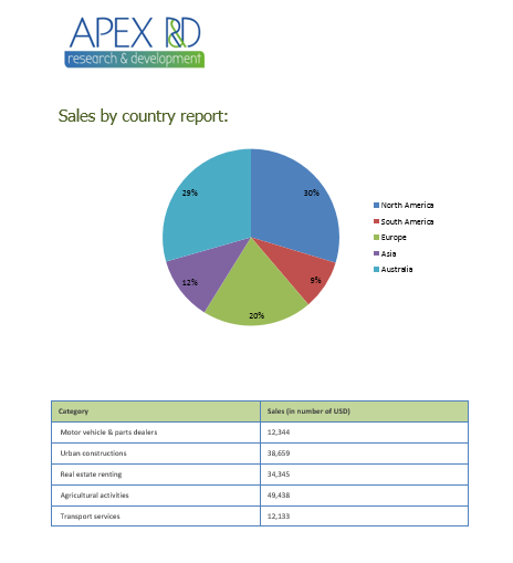
Example 3
This is the input template:
This is the result after Cloud Office Print has processed the template and the given data:
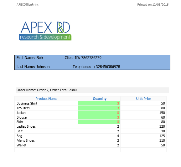
Example 4
This is the input template:
This is the result after Cloud Office Print has processed the template and the given data: